28 Apr 2010

Assignment 2 tutor feedback

My tutor must have been champing at the bit to get his hands on my work as it was assessed and back in less than 24 hours, thanks.  So what can I say... my hopes were realised and my fears came true!

Firstly I asked a few questions and they were kindly answered, in that YES it is better to stick to the required number of shots and not put in additional images as it is important to show that one can stick to the brief.  The choice of subject is also important so that there is both variety and a visual link to tie the shots together.

Good comments were made on the assignment as a whole collection and the Mail Boxes in particular.  I was complemented on an ability to look beyond the surface of a location and find interesting details in a place.  There was certainly no criticism of any particular shot so I take that as a positive point.

This is a learning experience and I was glad to receive a number of points on ways I can improve my skills.  It was mentioned that the assignment is about conveying a sense of a particular place and most of my images were too generic to fulfil that need.  I should have tried to convey more of the cities individuality.  I don't feel that the brief made this quite clear enough and I was approaching the task from a more practical direction, whilst still trying to produce pictures of technical and aesthetic quality however, I see now that hadn't quite gone the extra mile.

My blog included some of my editing rejects and, as I feared, my tutor thought that some of my assignment choices weren't the best on offer.  This is an area that I find difficult.  To give an example: I chose a chain and padlock as an example of an implied triangle...
     ... whereas it was thought that a couple shots that I rejected (the Grace building and the girls being sketched) had better qualities. 
The reasons I rejected these are in my blog but I must now reconsider my thoughts.  Although I really liked the Grace building I felt that it was too much like a real triangle and not an implied triangle. I must work through my notes to see why I made this error or perhaps the quality of the shot overrides the doubts I had on the graphic design feature I was trying to illustrate.  The picture of the girls was one that I was excited about as I was shooting it and I always felt it was going to be an interesting image... I just didn't like the expressions that I captured.  This obviously wasn't a strong enough objection.

Finally, it was mentioned again how important it was to reference my work against other photographers and to see as many exhibitions and shows as possible to widen my knowledge base as it is a really important aspect of the formal assessment.

So how do I feel about this one.  I guess I feel that I should trust my instincts and try to pick the shots that I really like and not the ones I think will please someone else or better match a brief.  I do have a tendency to come back to a portfolio again and again to re-examine my choices and perhaps I should just go with my first gut feelings?  

Still, I am now reading up on the next module and although I am going to start shooting the exercises soon I am going to ponder on this work and try to think through my concerns.  Wish me luck!

27 Apr 2010

Assignment 2 - Elements of Design

After an unwelcome delay overseas waiting for the Icelandic volcano to quieten down I am now able to publish Assignment 2, Elements of Design.

The photographs can be viewed on my Assignments web site here:

http://nicksoca.webs.com/photography1/artofphotography/designelements/designelements.htm


Assembling the Photographs


Although I had an unfortunately extended period to shoot this assignment I only had a short time to edit and publish it and with a fairly large volume of shots to assess I ended up having to do some fairly radical editing.  I thought it might be useful to post some of the discards and review my thoughts on why I didn't use them.


This view of an office block was one I considered for diagonals.  I liked the patterns within the shot and the details inside each box.  The face of the building showed nice and light against the shadowed interiors.  So nothing wrong with it but I felt that it was yet another very symmetrical box pattern and too similar to the shot I used for verticals & horizontals so left it out.


This shot was going to be one of my implied triangles but even having worked on it to the extent that you see above I wasn't able to get the results I wanted.  I was pleased enough with the framing but I just hadn't managed to capture enough expression on the faces of the ladies being sketched and I felt that the whole image lacked punch and contrast.  Every time I tried to improve one aspect of the shot another was lost, particularly the eyes of the lady to the right.


This shot appealed to me enormously when I was taking it and I worked hard to get the focus point and exposure on the reflected building just right.  I was going to use it as an example of horizontals & verticals but in retrospect it had a few problems I couldn't resolve.  I felt the image was just too confusing for someone seeing it for the first time, the lines weren't truly vertical or horizontal and the litter covered a bit too much of the image.  However, it is still one of my favourite images.


This shot of the Grace building was also one of my favourites and I was going to use it as an implied triangle.  The image has one of those 'frozen in time' effects on me with the stark tree and walking man against the white of the building.  I also liked the twist that the building has to perform to show the front as well as the side.  The reason that this fell to the cutting floor was that I realised it was a real triangle and not an implied one as the brief called for.


This was a hard decision and I am hoping from some feedback on my choice from my tutor HINT HINT.  This I felt was a good contender for an implied triangle, a person reading a book under the Walgreens sign.  Firstly I wasn't sure that the relationship between the dominant parts of the shot, the person and the sign, was strong enough to properly suggest a triangle.  Secondly, it would have been the 11th photograph of my set and I wasn't sure if it would have been pushing my luck to include it.  By including extra photographs can we be awarded more marks or do we just take the risk of bringing our grading down?  I would love to know.


 I had points in a deliberate shape in mind here.  I liked the whole look of the image taken down from a high building into a hotel swimming pool area.  I would have liked at least one person in the shot but that wasn't a real necessity.  My main problem with the image was the shape that the points were trying to make (what was it) and did it really qualify under the subject I chose of 'Street Detail'?  I wasn't convinced.


The bright colours of this street sign attracted me and I felt that this might be a good distinct shape.  It has many of the attributes of the image that I finally used and even now I'm not certain which I prefer... dreadful indecision!


This grid around a tree trunk was one I thought of for a pattern but it could equally have been used for curves.  Because I felt it didn't truly fall into one category or another I wasn't sure if it was a good idea to use it or the 'element of design' I was trying to represent then becomes defined by the title and not the photograph.


I used exactly the same view of these lamps as my points in a shape but took the image at night.  Although I liked this view and the reflections of the rising sun and the streets in the glass when I took the image up in size I started seeing jpeg artefacts in the clear blue which spoilt the image for me.  I felt it was also nice to include a night shot in the assessment batch for some variety.


This shot through a glazed roof was on my list for diagonals but I already had a couple of strong contenders and thought the predominance of vertical lines in the building behind detracted from the diagonals created by the roof in the foreground (which wasn't quite as sharp as I would have liked anyway).  Had I focussed on the foreground and shortened my depth of field to throw the background into a slight blur it would have worked a little better.

    
Guess what... another triangle that was real instead of implied.  I must READ the brief better!  Still I liked the image, taken in Grand Central Station, particularly as the overhead lights and the yellow strip help to delineate the perspective triangle that the train creates.


This old bike on the streets of New York was one of the images I wanted to use for curves.  Getting in close to the steel pipe of the bike stand helped bring it into dominance as did controlling my depth of field to give the bike a little blur.  I like the shot a lot but definitely preferred my chosen image of the mail boxes. 

-----------------

I always have doubts about my choices of photographs and find it much easier picking holes in other peoples work.  I also find that there are as many opinions about the merits of an image as there are people to ask but we do the best we can and hope  ;-) 

18 Apr 2010

Stuck in Boston

I came out here for a one-night stop flight and am still here after 4 nights with more to come... running out of clean clothes fast.  The volcano that has shut UK and much of the European airspace has grounded me here but at least it is better than being the crew in Lagos!  I have shot the last couple of images for Assignment 2 and was going to pick and publish my final choice on my return but everything is on hold at the moment.  This is very frustrating.

I haven't wasted my time having filled 12 Gigs of cards and worn out almost all of my batteries but the weather is now wet and very cold so not much motivation to do more photography at the moment.  All I can do is save something to shoot the Boston Marathon tomorrow as it might be a great subject.

So Assignment 2 is going to be late... sigh. 

 UPDATE
Back home after a 9 day trip and I think I have enough for Assignment 2 now.  I have to buckle down and assemble my shots but there are a few forest fires to put out at home first.

6 Apr 2010

Exercise: Pattern and Rhythm

For this final exercise in Elements of Design we were asked to shoot 2 photographs, one demonstrating Rhythm and the other Pattern.  The difference between the two is an interesting process of understanding that took me a while to get my head around.  A pattern is a repeating element that allows the eye to move around the image at random whereas with rhythm the image asks the eye to follow a particular path.

Walking the streets of New York I was looking for these elements in my surrounds whilst also thinking ahead to the second assignment that will be needed very soon.  I thought back to an exhibition I mentioned in a previous post at the Met and an example of the work of Miles Coolidge who had photographed a slab of concrete in LA.  I had been fascinated by the patterns present in this very ordinary object and wondered if I could see an opportunity to do a similar image for this exercise.

Pattern
  1/400, f11.0, 50mm, ISO400

Chewing gum is a national pastime in the USA and the remnants litter every street in the country.  The old black spots contrast a couple of newly masticated globs which break the pattern with a little colour, as does the discarded sweet packet.  The pavement line also breaks the image up into two sections but the pattern is repeated in both.

A retrospective look at my chewing gum had given me second thoughts.  When viewed at a suitably large scale the image has considerably more interest than can be seen here so I have decided to include a second, alternative pattern image below.

Pattern 
 1/160, f6.3, 60mm, ISO1250

The chandelier is in the Vanderbilt room of Grand Central Station, NY.  An unusually flamboyant addition to a railway station it provided a nice example of a pattern.  Although the lights do lie in a less than random way a tight crop has removed the regularity and added a feeling of curiosity that the pavement image lacked.
  

Rhythm
  1/200, f9.0, 47mm, ISO400 

Here the repeating lines of red chairs initially caught my attention but standing back a bit I could see that there was more to the shot than just the chairs as the colour became the rhythm that took my eye rather than just the shapes.  I found myself looking along the chair backs across the pile of chairs above to the line of folded umbrellas in the rhythm that I was looking for.  In addition, the shapes were mirrored by the buildings of Time Square in the back ground and the addition of the red bus helped take my eye from the foreground to that background.  I trust it does the same for other viewers? 

This exercise completes my work for Design Elements and I must now concentrate on assembling the images I need for Assignment 2, due in a week or so. 

27 Mar 2010

Exercise: Real and implied triangles

Shapes form one of the building blocks of graphic design and the simplest and most common shape is the triangle.  Any three points can create a triangle so they exist many times over in almost any view.  Triangles can be seen in many forms or they can be created by perspective, enhanced by the use of short focal length (wide angle) lenses.

This exercise asks us to produce 6 photographs to demonstrate real and implied triangles.  Firstly we are required to shoot a triangular subject and then two perspective triangles, one pointing up and one pointing down.

  
My first is a triangular subject which I found in the form of a monument to the Korean War in Washington DC.  The soldiers depicted are in an open triangular formation leading away from the viewer and although this isn't a solid triangle I felt it was more interesting than many other examples that I had to hand.  Perspective has helped to create the depth of the triangle but it is not required to create the shape itself.


My triangle pointing up is the Reflecting Pool to the Washington memorial in Washington DC.  The shape of the pool creates a perspective triangle which is nicely completed by the needle shape of the Washington memorial in the distance.


My triangle pointing down is the vaulted roof of Grand Central station in New York.  At first it was hard to work out just how to create an inverted perspective triangle since most of the time they occur looking away to the horizon or up at a building.  I just had to work out that to get the reverse I would have to be looking down a tall building or at retreating parallels that were above the horizon to get a down pointing triangle.
For the implied triangle portion of the exercise we were asked to shoot 5 or 6 objects that create a triangle shape as a still life.


My triangle with the apex at the top is made of a pile of weights that sit on an old fashioned set of scales.  The frame of the scales nicely frame the weights with their reflection in the pan coming to a convenient point.

Six screws provide the triangle apex down and I was able to reproduce the triangle twice with both the tips and bases of the screws giving rise to the shape.

The final part of the exercise was to photograph 3 people so that they formed a triangle.


These 3 guys who form part of a metal band were kind enough to pose for me and their relative heights gave rise to the triangle of faces, helped by my shooting from above their eye level.  For inspiration I thought of the work of the English photographer Mick Rock who photographed many of the most famous bands in the 70's including Pink Floyd, Ziggy Stardust and Queen whose iconic photograph for Bohemian Rhapsody used high lighting and a black background to isolate and emphasise the musicians faces.  Mick is still very active after three decades and recently photographed REM, the Foo Fighters and the Motley Crew.

Exercise: Implied lines

Implies lines are those lines that our minds put into a picture to follow a natural path or to resolve the incomplete projection of a line.  The exercise starts by asking us to look at two provided photographs and sketch in the implied lines that exist.  I have reproduced the photographs below and added the implied lines.


The left picture has three major implied lines all of which centre at the neck of the bull.  The two indicated follow the lines of the capes and the third, which is harder to illustrate is the unseen eye-line of the matador.  A less obvious line but one which adds to the flow and movement of the image is the curved red line in the sand which leads round the back of the bull fighter's feet and round to the bulls head.
 The black and white image of Corn Threshing has 3 implied eye lines which lead in a circle from the second horse to the lead horse and on to the handler who is himself carefully watching the running horses.  This circle of lines is a powerful link between the parts of the image and keeps the composition alive and full of movement.
From our own efforts we are asked to find 3 images from our stock and perform the same exercise.

This image of the Australian cricket team playing in Capetown has the fast bowler celebrating a 5 wicket haul by holding the ball aloft.  He stands ringed by his fellow players who, with one exception are concentrating on him and directing our eyes in the same manner.  The other less obvious line comes from the TV camera under the red umbrella to the left of the image which is also directed to the group.  Interesting observations come from the audience who are probably South African as, although they are sportingly applauding are looking everywhere but at the Australians.  Indeed, the little Australian wicket keeper has also found something more interesting giving the celebrations something of a staged look.


I rather like this image as the windsock, which provides a strong implied line down to the man standing by the chair, looks rather like a huge vacuum cleaner about to suck him off his feet.  The edge of the hill isn't well defined which blurs the foreground into the background and gives a strong impression of being high above the terrain.  

Here, the girl in the centre has passed a comment that has attracted glares from her fellow diners whilst she, rather smugly, sips from her wine.  The two eye lines here are strengthened by the expressions of the staring girls.

I included this fourth image out of pure interest and to illustrate some thoughts I had on the subject of implied lines.  A Chinese beggar abases himself in Shanghai and is studiously ignored by the local people around him.  I felt that this was the corollary of the direct lines that we have been looking at in previous pictures as, by gazing away and turning their backs on the beggar they are still directing our attention to him.  To see this we have to examine their body language and the way they act as a group but I feel that this is a valid effect.

The third part of this exercise required us to take further photographs which illustrate an eye line and an extension of a line or lines that point.  The next few pictures I took a couple of days ago in Washington DC.

   
Here is a cycle cop patrolling an anti terrorist barrier that helps to guard the street leading to the White House.  He has stopped to use his radio in a line of bollards that provides the implied line leading us across the picture to him.  The Do Not Enter sign helps us to understand his presence, as does the guard post.  This is a simple but effective illustration of the principle we are studying.


These photographers are taking images of the Vietnam memorial in Washington so their attention is directed towards the statue.  They have placed themselves in the eye line that the artist created when making the statues so whilst the photographers look at the soldiers, they look back.

 
Here a tourist gazes down onto the White House.  Although the face is not visible the eye line is strongly suggested and points to the building; our presence in the great USofA is emphasised by the stars and stripes on the tour bus.


I thought I would add this final image as although the lines of the great columns don't point directly at the government 'suit' who is the subject of the image, the gap between them does the job well and as such, in the same way that the beggar is being ignored in the photograph above, the line is implied.

16 Mar 2010

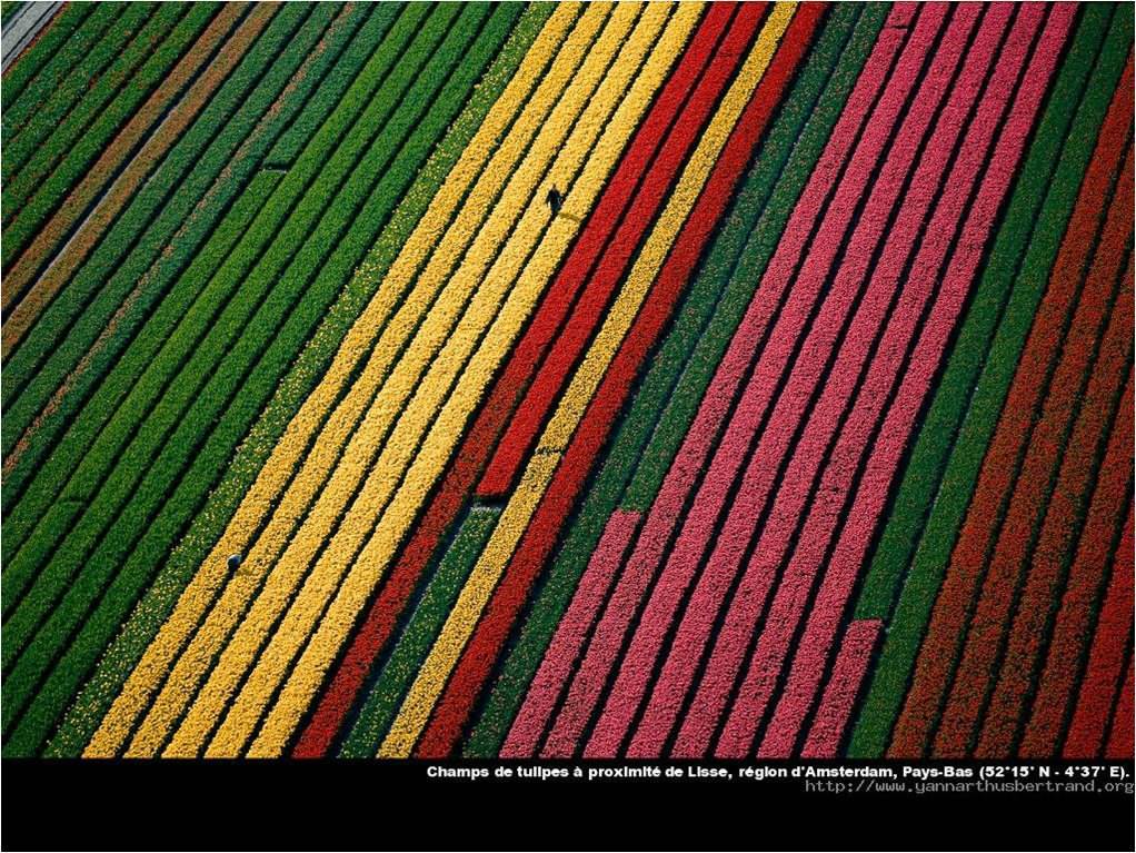
The Earth from the Air by Yann Arthus-Bertrand

Part of my tutor feedback mentioned the need to reference my work to existing photographers and specifically mentioned Yann Arthus-Bertrand's aerial photography as an example of work that I could have mentioned.  I should have realised the need to mention my influences as I have had some of his work on my book shelf for a few years.


Yann was born only 8 years before me in 1946 and began his career in film/photography at the age of 17 when he became a director's assistant.  After a few years he left to help run a wildlife park in the Masai Mara, Kenya and developed his passion for photography, particularly of landscapes and aerial photography from balloons.  His talent took him back to Paris where he had grown up and he became well known as a journalist, wildlife, sport and aerial photographer.  He published many books and was famous for his annual book on the French Open tennis tournament at Rolland Garros. 

In 1991 he started the world's first press agency that specialised in aerial photography.  He was sponsored by UNESCO to study the state of the world through his photography and this lead to a book called 'The Earth from Above'  which sold over 3 million copies in 24 languages.  His knowledge of the problems facing the planet have made him a committed ecologist and he has achieved wide recognition for his efforts to publicise the effects of man on the world.

The book that I have is a collection of 365 photographs, one for each day of the year, taken from the air.  It is a remarkable and fascinatingly catholic set of images that show some of the most stunning views that anyone is likely to see.  Yann has used pattens and lines in the landscape, both natural and man made to create images of great distinction.
Look HERE, HERE, HERE and HERE.

In my own way I have been able to take some aerial images but there is a great difference between the environments that we work in.  Shooting from 35,000 ft in the air, through several layers of laminated glass, plastic and metal elements that form the windows of an airliner has a challenge that Yann doesn't face.  He is able to shoot from a slow moving platform at only a few thousand feet, or lower, where atmospheric effects are negligible.  He photographs through an open door or window with nothing to blur or reflect back at him.  He is also able to direct his aircraft or helicopter to a location and repeatedly overfly it from the right angle until he has the shot that he wants.   Although some of my 320 passengers might not mind I'm afraid that the option to circle a beautiful feature isn't really an option for me!

This doesn't stop me from admiring Yann's work.  He has a fantastic eye for balancing an image and creating exciting lines and points that I am in awe of.  An example HERE of a ship carving through an ice flow is, at first glance a rule breaker (as well as an ice breaker).  The ship runs a line straight down the centre of the image but he has used the bottom third line to place it which works well.  As in many of his images he uses symmetry beautifully and the central placing lets the ship become an important part of a patten of white icebergs.  The movement of the ship gives enough dynamic feel to the shot and by using a horizontal format he emphasises the large area of ice it is sailing through.  An image of the same ice filled sea that I took falls down on many levels in comparison...
There is, of course no point of interest in the image, the ice is too far away to become anything but a random patten, the blue cast is an inevitable result of the shooting through 36,000 feet of atmosphere (what do you think makes the sky blue... it works looking down as well as up).  In addition there is a bad distortion in the bottom left part of the image from the poor optical quality of the aircraft windows.  Not all of my aerial images are so poor... this next image is a glacier flowing towards the sea in Greenland.
The lines across the ice create enough interest to form a pleasing shot despite the lack of a point of interest and I have desaturated the image to remove the blue cast.

HERE is another of Yann's beautiful shots of a black volcano in a sea of fantastic green vegetation.  The colours in this image are almost beyond belief and put my efforts below into the amateur class.
 I hope that I don't need to mention the limitations that I must overcome to get good photographs again but a quick look at the orientation and the colour stripes at the bottom of the image should give a clue!

So although I am very limited on opportunities and the environment that I shoot from I still fly with my camera beside me in case a rare chance for a good image comes along...

 The mountains of Afghanistan

Sunrise

Greenland

 Passing aircraft


 Moon rise

Reading about Yann and looking through his images has taught me to look for the same type of contrasts within the landscapes I fly over.  My aerial work has improved and I often think back to his iconic images when I am trying to compose a view through the aircraft window.  In particular, his use of lines and points is an illustration to us all on how powerful they can be.  

A lovely collection of Yann's photographs can be found HERE.

14 Mar 2010

Exercise: Curves

Curves have a feeling of movement and direction similar to diagonal lines.  The exercise requires four images that demonstrate these qualities.

1/80, f6.3, 24mm, ISO100
Covered driveway

1/500, f10.0, 82mm, ISO100
Frozen lake

1/300, f7.1, 90mm, ISO100
Fence with shadow

1/320, f8.0, 75mm, ISO100
Wind art

I am happier with my curve images than I was with a couple of my diagonal shots as I feel that I have got a better grip of the brief.  Certainly they all have a stronger feeling of movement and direction.  The covered driveway has a lovely pair of mirrored curves that lead away and are complemented by the concentric circles created by the paved road.  The vehicle adds to the feeling of movement and direction, albeit in a rather obvious way, nevertheless it works for me.  Below it, the Frozen lake leads right from the bottom of the shot upwards in a sensuous series of curves that takes the eye up to the less obvious river that completes the journey to the edge of the frame.  The white ice makes a great contrast between the lake and the surrounding terrain.  The iron Fence with shadow is a nice continuation of the curve to complete a half circle.  The radial lines create the sense of movement from the centre of the circle outwards.  Finally, the Wind art is a multiple exposure (albeit a digital version) which shows the potential of the moving artwork to swing in the wind.  The curved line of the building complements the curve of the artwork and the whole thing works on several levels, as a series of curves, contrasting colours and the impression of movement. 


Exercise: Diagonals

In this exercise we are asked to shoot four images that use diagonal lines strongly in the image.

 1/1000, f13.0, 105mm, ISO200
Ice cracking in Hudson Bay, Canada

 1/250, f10.0, 24mm, ISO100
Walkway in Pasadena, Calafornia

1/1600, f14.0, 105mm, ISO400
Crossing vapour trails

1/400, f9.0, 92mm, ISO100
Building front

To obtain these diagonals I have used a combination of naturally occurring diagonal lines and those created by the camera.  The particularly strong images come from those repetitive angles as in the Building front above.  Here the repetitive rhythm of the lines adds to the feeling of direction that the diagonals create.  The strong perspective created by the use of a wide angle focal length in the Walkway in Pasadena give diagonal lines that run into the distance but the angled pergola and zigzagging curb enhance the feeling of sharp and distinct lines.  To contrast the symmetry of the formal lines of building work I have included a shot of breaking ice that has natural breaks and sharp diagonals that lead across the image.  The lines of vapour trails show something that I didn't expect in that, rather than creating a feeling of movement they have a very static effect, perhaps caused by the central crossing of the lines.