I think I made my point earlier about the differences between how colour is displayed and perceived. The colour wheel that we have been given is probably not what Michel Freeman had in mind when he wrote the notes but more what the printer was able to achieve at a cost. How we see colour depends on many factors and even if the exact shade is achieved it will look different to the eye depending on what kind of light is present. Natural sunlight in the morning tints everything we see quite differently from midday and the evening and the presence of cloud or reflected light will alter things further. Artificial light has its problems as well by casting differing effects depending on the type of bulb.
The camera adds its own complications as what it sees is restricted by the limitations of the technology and the manipulations that the manufacturer adds when converting the sensor's view of the world into something that we can see. Add to that the changes that can occur when we finally display or print the colours and I think we are lucky to be able to recognise red from green... I won't even start on the differences of human perception and how our eyes and brains can deceive us.
So our colour wheel isn't the same as a pure screen colour that Photoshop (the circles of colour inlaid) produces as we can see below.

And the colours above aren't quite the same as the professional colour checker that I photographed a couple of minutes ago either. This is because of the variables that I mentioned earlier. Any one of many factors might cause a change but comparing it to RGB colours above the only one I would really question is the green which is a livid lime green according to the RGB settings, a darker green on the colour wheel and a lighter but more blue-green on the colour checker.

The point I am making here is that my attempts to match colours for this exercise have been coloured (please excuse the pun) by my realisation that it is beyond the wit of a mere mortal to make an entirely accurate match. Not only do our eyes deceive us but so does the camera, the sun and the way we view the results. What you are seeing on your screen is probably not exactly what I am seeing and unless we all decide to meet in a laboratory to look at these results you are going to have to trust me!
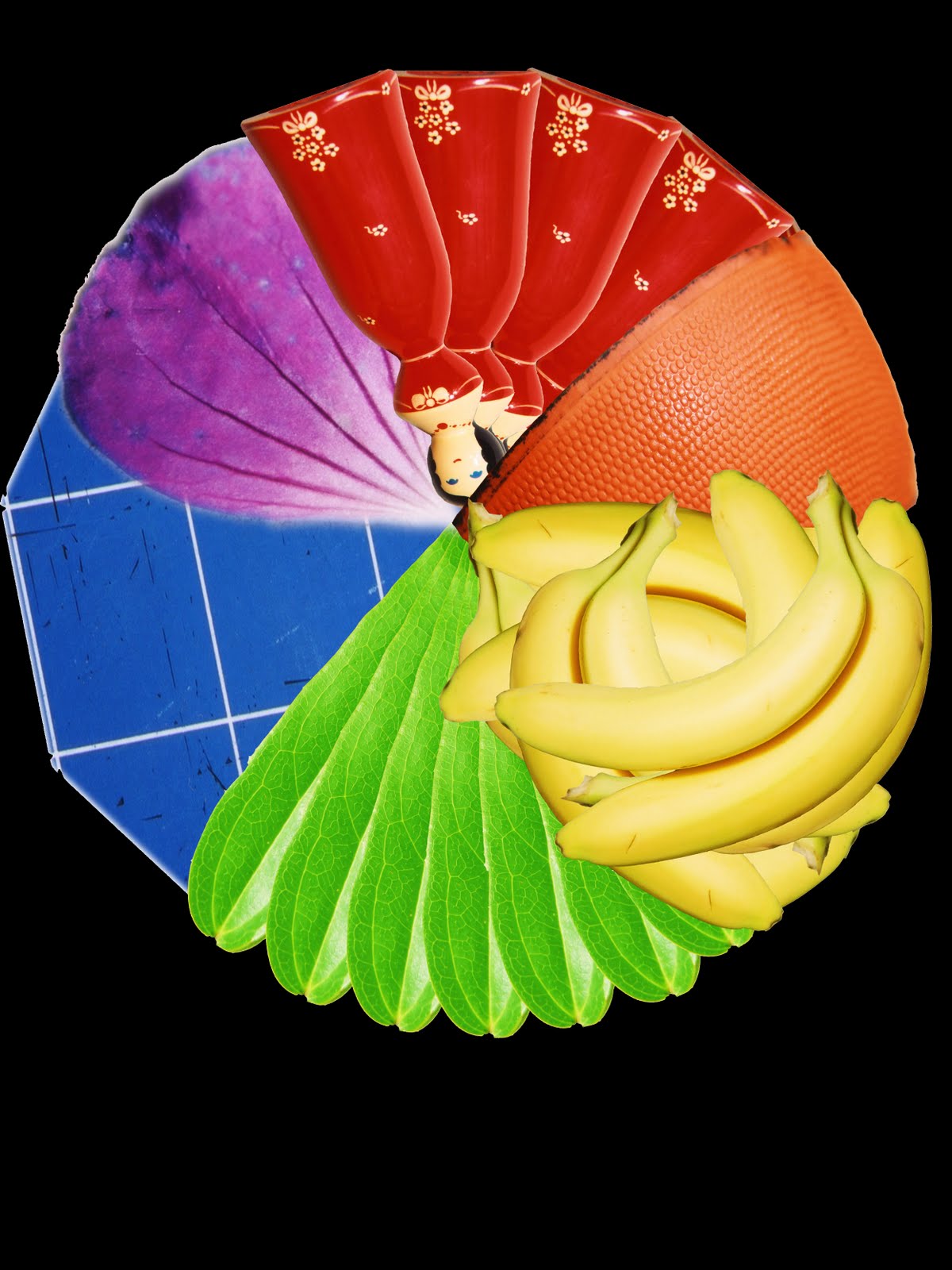
We might all just as well use this colour wheel I made a few years back for another course!

So with no more ado or excuses I publish my colour pallet.
Yellow

Orange

Red

Violet

Blue

Green

Of course no one scene can easily demonstrate a single shade of colour. All the images above show a variety of differing shades of the main colour, some more than others but in there somewhere is going to be an exact match for the correct colour.
I have to say that in my earlier attempts to do this exercise I tried to stick too close to the brief and ended up shooting in circles. I also realised that in nature it is just about impossible to isolate a particular colour without resorting to macro photography and I didn't want to go there. I think the point was to get me out there looking and appreciating colours whilst trying to educate my brain in the basic hues to give me a starting block to build on. I have no regrets about shooting mainly man made colours... they all started off in nature as crushed plants or beetles and if you want pure colours there are few other places to find them.
I have to say that in my earlier attempts to do this exercise I tried to stick too close to the brief and ended up shooting in circles. I also realised that in nature it is just about impossible to isolate a particular colour without resorting to macro photography and I didn't want to go there. I think the point was to get me out there looking and appreciating colours whilst trying to educate my brain in the basic hues to give me a starting block to build on. I have no regrets about shooting mainly man made colours... they all started off in nature as crushed plants or beetles and if you want pure colours there are few other places to find them.

Great set of images Nick and good to see you back
ReplyDeleteI second Janet's comment Nick, good to see your pictures again.
ReplyDeleteBrian
Thanks for your encouragement my fellow students.
ReplyDelete