22 Nov 2010

The Mexican Suitcase!


In 2007 a suitcase which had been lost since 1939 was found.  Not in Heathrow's Terminal 5 and not full of dirty washing but in Mexico City and containing the lost negatives of Robert Capa's photographs of the Spanish Civil War.  The suitcase had been passed from hand to hand for safe keeping but eventually its location became unknown until by chance the negatives were found and recognised for what they were.  Not only Capa's work but also those of fellow photojournalists David Seymoure, Fred Stein and Gerda Taro were in the collection.  There were nearly 4,500 negatives.


I was lucky enough to get a chance to view this unusual collection at the New York International Centre of Photography where there was an exhibition of the negatives and of some of the prints that have been made from them.  The war broke out in 1936 and was a military coup led by General Franco and instigated to overthrow the democratic government.  The suitcase contained an extraordinary window into the vast output of the three photographers during the war.  Portraits, battle sequences and the harrowing effects of the war on civilians were on display.  The material not only provided a fascinating view of the war but also demonstrated how the work of these key photographers laid the foundation for modern war photography.


It was sad to note that Gerda Taro was killed in battle in July 1937.

1 Nov 2010

Henri Cartier-Bresson at the SFMOMA


Although I was forced to put my work to the side for a few months I have continued to pursue my interests both with my camera and my eye. Whilst in San Francisco a poster caught my attention and I took time out to visit the San Francisco Museum Of Modern Art (SFMOMA) to look at some work by Henri Cartier-Bresson.


Cartier-Bresson (C-B) has long been considered one of the original street photographers and the father of the modern reportage style of photography that has influenced so many photographers.  As a lover of street photography I view his work with reverence so was delighted to get the chance to see some of it in the flesh.  


The exhibit was well attended despite being the middle of the week and I was delighted to be able to use my camera and sound recorder to make notes as I went around.   The work being displayed ran from some of his early work right through to the photo journalistic work that he did later in life.  I have singled out some of the prints that I saw for attention as they particularly appealed to me.

Valencia - Spain 1933

Taken in 1933 this image is of a couple of uniformed workers by a garage.  He has, in a moment, seen an opportunity to capture the head of one worker looking through a square cut in the door whilst his colleague comes through the doors looking away.  Our attention is taken by the disembodied head which looks even more strange with one eye glass opaque and yet our interest is further piqued by the open door and the other worker coming out, his attention directed into the darkness allowing us to wonder what is inside.

Not all of his work shows such spontaneity and I found a few images to be quite obviously posed with the peoples attention directed at the camera whilst they vie for attention.  These may have been images that he took for his work but they don't have the same attention grabbing quality for my taste.  One such image can be found here.

C-B was present at some momentous occasions throughout history including the funeral of Mahatma Gandhi and he took some remarkable shots of the event and the anguish shown by those present.

Brie - France 1968

This photograph taken in Brie is a wonderful landscape that in many respects follows the rules beautifully.  The road and trees are on the left 1/3 and the horizon is on the bottom 1/3 but then he does something unexpected that, for me, makes the photograph... he leads the road out of the frame to the left!  I would have placed the road to the right and led the observer into the scene and it would have been a  beautiful but conventional view.  Had I done what C-B did I have no doubt that an assessor might have looked at it askance and wondered if I knew what I was doing!  In the case of C-B he is obviously well aware of the imbalance and the way it adds a little tension and wonder as we are naturally curious as to where that road goes but not provided with an answer by the photographer.  We have to use our own imagination.

Juvisy - France 1938
 
Although I believe that this is probably a posed shot, the family take no interest in the photographer and are all caught in mid-action, it doesn't detract from the composition.  There is no eye contact with the camera and the position of the grouping takes us from the large gentleman in the foreground pouring his wine down the bank observing each person in turn and eventually out to the punt, moored with the fishing rods lazily dipping into the river.  I love the way that no-one is making eye contact so we are put in the place of a discrete observer of this family scene.  It is 'everyday' but the composition makes it much more than that and from a modern aspect gives us a beautiful and sentimental view of life for these people.
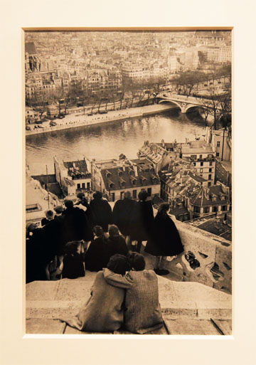
Paris 1953

This view of the Seine in Paris taken from a high vantage point overlooking the city is a great example of C-B's eye for the moment.  A great view of the city but made so much more by the interest we find amongst the people in the foreground.  He was so much the master of catching moments like this that it is hardly surprising I delight so much in his work.  From the courting couple in the foreground to the horseshoe of school girls in their black capes around the balustrade, all is designed to give the image great interest, a wonderful depth and to take our eyes out from the foreground into the distance.  Anyone who has ever shot a city scape needs to see this image as a lesson in how to turn a straight forward photograph into something much more special.

New York 1947

I have to be honest and admit that I don't really associate C-B with America but he first went there in 1935 to exhibit work and did some shoots for Harper's Bazaar.  He shot a documentary about war refugees for the American Office of War and about the time of this photograph he helped found Magnum Photos with other renown photographers Robert Capa, David Seymour and George Rodger.  The photograph here that he took of a New York free-way has a surprisingly modern feel to it albeit with a tiny fraction of the cars we would now see.  For me the image is a sinuous series of lines that complement each other as they copy the line of the river bank leading up to the horizon.  He has made a conventional and contemporary (of the time) view into a very pleasing image that reflects many of the attributes we learned in our Elements of Design module.

Miami 1957

C-B had the perfect knack of summing up a place in one simple view.  This is a classic example and there is really no need for the caption as anyone who has been to Miami will recognise that the essence of the place has been truly captured.  Bright white buildings lining the ocean in stark and unforgiving sunlight.  An older man slavered in oil with skin as dark a mahogany is massaged by a pool.  A picture truly paints a thousand words.  Not only is this a thoughtfully composed shot from the point of its content, note how the walls enclosing the sunbather follow the 1/3 lines and help to direct the eye up into the shot following the left wall up into the line of the street beyond. 

Henri Matisse - France 1944

C-B was also a master of portrait photography and during his life shot many famous personalities, Truman Capote, William Faulkner, Coco Chanel, Jean Paul Sartre, etc.  The image here of his friend Henri Matisse is shot only 10 years before Matisse dies.  He is suffering from an illness, recently divorced and consigned to a wheelchair.  The painter and sculptor who was nicknamed 'Wild Beast' is captured low and small in the frame wearing a turban, and surrounded by birds.  A shadow of his former self and looking a broken man, C-B has captured the essence of a man in the decline.  What is not obvious from my reproduction above is how C-B has used depth of field to bring Matisse to prominence in the photograph, despite giving him a subordinate position when compared to the open cage of doves in the foreground.

Nara - Japan 1965

This is a photograph that reflects some of my own efforts to find patterns and interest in unlikely places.  Shot in Japan near the old capital city of Nara, this is a simple image of swirling water in a ditch, probably at the side of a padi field. I find it delightful that C-B saw the opportunity for a meaningful image in something that many would walk by without a second glance.

 
 BBC 1967

 As comfortable in an interior setting as outside, C-B never used flash photography.  He was also renown for composing his photographs completely in the view finder and never allowing cropping or recomposing when printing to the point of often showing the edges of the negatives when making prints.  Despite this he was quite capable of moving with the times and taking shots of, what was then considered, state of the art technology.
 
 Berlin Wall 1962
This moment of observation is a classic C-B moment.  Without knowing any better, I do wonder how he was able to be in the right place at the right time so often in his life.  The balance of this image with the one legged veteran of the war, the guard, the lamp post and the guard hut all working together to create the narrative of the photograph seem an impossible fluke of street photography.  Yet for C-B these moments seemed to follow him around.  No wonder he called his classic book of photographs 'The Decisive Moment'.

"In photography, the smallest thing can be a great subject"
Henri Cartier-Bresson


17 Aug 2010

Colour into tones in black and white

In my previous wet film life I enjoyed shooting B&W which I processed in my darkroom but I was never much of a fan of 'on camera' filters.  I preferred to work on the prints in the darkroom but this exercise has shown me just what I might have been missing.  Certainly the effects of colour filters on tones of grey are considerable but I am glad that I can apply these effects digitally in post production rather than having to work them out beforehand.

For a digital photographer the exercise asked us to shoot a single still life that displayed the primary colours of Red/Blue/Green plus the additive colour yellow thrown in.  We were then asked to apply in post production a Black & White version plus an additional version of Black & White with Red, Blue, Green and Yellow filters applied.  In Photoshop this is achieved by selecting Image/Adjustments/Black and White and then moving the appropriate colour slider.

We were also asked to shoot the image in an appropriate format such as JPG so that RAW processing wouldn't affect the initial image.  In addition our exposure settings should be suitable for a neutral grey which I did separately.

So my 18% grey card shot looked like this...
... which looked like this on my camera back.
 
As you can see a manual setting of 100/f8.0 at ISO400 gave a nice middle of the road exposure for the grey card as can be seen on the histogram.

Under the same light conditions I shot my colourful still life in JPG format.


The rest of the exercise relied on Photoshop and the first change I made was to move the image to Black & White using the average Default settings.  These were not as I expected with all colours at Zero but ran as such...
Reds 40%
Yellows 60%
Greens 40%
Cyans 40%
Blues 20%
Magentas 80%
...with the final result looking like this.

I then set about changing the slider setting to simulate the RGBY colour filters but I did this in two ways.  Firstly I manually set the sliders to emphasise a particular colour and then I tried again using the pre set Photoshop filter settings.  They looked like this:

RED MANUAL SLIDER

Here I brought the red up to around 120% and reduced the other colours to near zero but ensuring that the textures were still clearly visible.  The Red Bournville chocolate wrapper has turned almost white but the rest of the colours remain fairly unaffected except the area of the yellow sweet which had some red reflection on it as it lay close by.

RED PRESET FILTER
 
The big difference between my efforts and the Photoshop standard is that it raised the yellow bias to 120% whilst reducing the cyans to -50%.  This has resulted in an unwelcome brightening of the yellow hue and an overly dark blue hue.

GREEN MANUAL SLIDER

The green slider had the expected effect of brightening the green hue but this change is not as impressive as the red example earlier.  The green shade of grey was a mid grey in the first place so the alteration has not been so dramatic.  I could have emphasised the effect further but this would have been at a loss of detail through overexposure.  The darkening that I made to the other colours, however, has helped to single out the change to the green sweet.
GREEN PRESET FILTER
The pre set filter has again had the unexpected effect of raising the amount of yellow as well as green, which has been lifted less than I did to only 90%. The yellow was raised to 120%.  This green increase is only up 50% from the standard B&W conversion.  I am beginning to realise that these pre set amounts are probably based on a nature photograph where it would look unnatural to have grass and leaves at such a light shade.  Why the yellow should be raised for a green filter escapes me at the moment.
BLUE MANUAL SLIDER
 
Here the blue hue has had a slightly more dramatic alteration from its original shade than occurred with the green.  I was able to play with two sliders to obtain this effect and found that the cyans slider had an excellent brightening quality and although I also raised the blue slider I didn't move it as much to ensure that the texture of the sweet wrapper remained.

BLUE PRESET FILTER

The blue preset filter raised both blue and cyan to 110% and reduced Red, Green and Yellow all to 0%.  This has the effect of really emphasising the blue sweet whilst rendering the others down almost into the blacks, particularly for the red and yellow hues.

YELLOW MANUAL SLIDER
 
As expected the yellow sweet had brightened nicely, except for the areas which showed a red reflection from the adjacent red sweet. 

YELLOW PRESET FILTER

Here the Photoshop pre set effect has increased the red slider as well as the yellow and brightened both hues.  This was another unexpected result.

In conclusion... it is clear to see that the manual use of the sliders can individually brighten (or darken if required) the basic primary and additive colours.  Used in combination it is possible to alter the brightness of almost any colour.  The pre set filter options that Photoshop provides do much more than altering an individual colour but may be more suited to an overall scene.

Back to work again!

Well, the weeks have run by and I have little to show for it.  At last the house is becoming ours again and I can unpack my camera gear and get to my computer.  Although the building work is not yet finished I have been able to recommence the course.  I haven't been at work either, having had surgery which has been very reluctant to heal properly but, although there is more to come I am at least fit to fly and photograph!

14 Jul 2010

Colour Relationships - part 2

Having been constrained by the difficult task of shooting photographs that comply with Gothe's colour relationship theory we have now been tasked with shooting 3 or 4 photographs that demonstrate how images that don't comply can also be 'correct'.

As an aside, this isn't the first set of 'rules' we have learned, only then to be asked to break them!  In photography, I am increasingly aware that complying to a set of acknowledged conventions is the safe path to a good picture but many brilliant photographs are achieved by breaking those conventions.  Only by learning the rules, however, can we understand what we have achieved when we deliberately go out to defy them.


This first image was taken in Shanghai, China.  The Chinese seem to have a love for large blocks of primary colour in their architecture.  They have huge estates of houses all with brilliant red roofs and then next door is a similar estate all with bright blue roofs.  It seems to be a crude use of colour and reflects an overbearing authority that dictates, rather than allowing personal choice.  Here is a classic stark orange entrance hall to a block of offices that is surrounded by a bright blue wall.  Orange is a very dominant colour and would normally appear in a smaller ratio to blue than I have shown here but I like the way it takes centre stage in the image, overpowering the blue wall although the wall is trying to hide it.  The appearance of the token tree has the effect of breaking up the line of orange and being on the centre line of the photograph adds to the symmetry.  Waiting for the girl to walk into the frame, however, has taken what might just as well have been a Lego block approach to photography and adds a little social commentary.  This is where people have to live!


This van was parked up in a New York street and is a mobile graffiti wall.  The colours look like a complete mishmash but when taking a closer look the artist has chosen 4 of the primary/secondary colours from the colour wheel and a 5th colour, green, is on the door.  Yellow and blue dominate in area and blue certainly takes the subordinate role of shadow to the bold yellow letters which is a good use for it in this context.  Red appears as a highlight to emphasise parts of the lettering and the whole area is lined with violet which acts surprisingly well in its task despite scoring the lowest on Goethe's numeric allocation.  I like the chaos of this image and the disreputable character who sits idly by, however even in chaos the colour has a purpose and a meaning.


These running shoes have three rather cute shades of violet and are surrounded by an expanse of orange.  Orange scores very high on Goethe's scale as an 8 whilst violet is only a 3.  Despite this I feel that the orange street and the advertising sign only help to emphasise the presence of the shoes.  This is partly due to the depth of field putting the background into blur and partly the lines created by the legs of the passer by.  This was no fluke as I needed those legs to add interest to an otherwise rather run-of-the-mill photograph.  It looks to me like the shoes are just waiting for those legs to walk into them and start running.  So despite the difference in colour emphasis, I feel that this combination has worked well.


I wanted to show that I am capable of taking photographs in this module that are more naturalistic and that not every shot had to include hues straight from the colour wheel.  Here is a pagoda in the gardens of a Japanese temple and the singing lady in the kimono is being accompanied by a man playing what is probably a kokyÅ«, traditional 3 stringed instrument played with a bow.  That explained, the colours are a lovely combination of red and green, although the green is dominant in area.  This doesn't distract from the image as the red serves to highlight the performers and because of it's prominence in the centre of the image it holds its own well.  The splash of blue that the kimono gives also works well as although blue scores well below green/red the muted natural colours of the foliage give way to the more strident hue that the blue gives.  It works for me and I hope it works for you too.

13 Jul 2010

Colour Relationships - part 1

The opposite colours on a colour wheel are considered to balance each other in a harmonious pairing so that they look pleasing to the eye.  However, because the quality of the hues vary so much the proportions of each colour in a balanced picture should also vary.  For example, whilst Red and Green are considered to be equal in hue and should be present in the ratio 1:1, Yellow and Violet should appear in the ratio 1:3 This is because a Yellow hue is considerably brighter and more dominant than Violet.  A balancing ratio for Orange and Blue is 1:2.  It was the German writer and polymath J W Goethe who first suggested that the hue of colours could be represented by numbers and therefore calculated the ideal ratios.  He made several reasoned conclusions about the relationships of colours which he published in his book The Theory of Colours.

This exercise asks for three photographs demonstrating the primary and secondary colours in pairs and in the correct ratio for balance.  Whilst it might appear at first glance that the proportions are a little skew, I have balanced those shades of colour that represent the correct hues and where light or exposure have changed the hues to a different shade I have ignored them in the calculation of the ratios.

Red and Green

Orange and Blue

Yellow and Violet

9 Jul 2010

Primary and Secondary colours

I think I made my point earlier about the differences between how colour is displayed and perceived.  The colour wheel that we have been given is probably not what Michel Freeman had in mind when he wrote the notes but more what the printer was able to achieve at a cost.  How we see colour depends on many factors and even if the exact shade is achieved it will look different to the eye depending on what kind of light is present.  Natural sunlight in the morning tints everything we see quite differently from midday and the evening and the presence of cloud or reflected light will alter things further.  Artificial light has its problems as well by casting differing effects depending on the type of bulb.

The camera adds its own complications as what it sees is restricted by the limitations of the technology and the manipulations that the manufacturer adds when converting the sensor's view of the world into something that we can see.  Add to that the changes that can occur when we finally display or print the colours and I think we are lucky to be able to recognise red from green... I won't even start on the differences of human perception and how our eyes and brains can deceive us.

So our colour wheel isn't the same as a pure screen colour that Photoshop (the circles of colour inlaid) produces as we can see below.
 And the colours above aren't quite the same as the professional colour checker that I photographed a couple of minutes ago either.  This is because of the variables that I mentioned earlier.  Any one of many factors might cause a change but comparing it to RGB colours above the only one I would really question is the green which is a livid lime green according to the RGB settings, a darker green on the colour wheel and a lighter but more blue-green on the colour checker.

The point I am making here is that my attempts to match colours for this exercise have been coloured (please excuse the pun) by my realisation that it is beyond the wit of a mere mortal to make an entirely accurate match.  Not only do our eyes deceive us but so does the camera, the sun and the way we view the results.  What you are seeing on your screen is probably not exactly what I am seeing and unless we all decide to meet in a laboratory to look at these results you are going to have to trust me! 

We might all just as well use this colour wheel I made a few years back for another course!

So with no more ado or excuses I publish my colour pallet.

Yellow

Orange

Red

Violet

Blue

Green


Of course no one scene can easily demonstrate a single shade of colour.  All the images above show a variety of differing shades of the main colour, some more than others but in there somewhere is going to be an exact match for the correct colour.

I have to say that in my earlier attempts to do this exercise I tried to stick too close to the brief and ended up shooting in circles.  I also realised that in nature it is just about impossible to isolate a particular colour without resorting to macro photography and I didn't want to go there. I think the point was to get me out there looking and appreciating colours whilst trying to educate my brain in the basic hues to give me a starting block to build on.  I have no regrets about shooting mainly man made colours... they all started off in nature as crushed plants or beetles and if you want pure colours there are few other places to find them.


Back to work

Ok... things have quietened down a bit and I have an extension from my tutor so I am getting back to work as time allows.  Summer is silly season and work tends to go through the roof so the time I can allocate to less remunerative pastimes becomes smaller.  Study time comes under the law of diminishing returns and according to my wife, my employer, my children and my dogs (in that order) my free time comes last in the list.

11 Jun 2010

Frustration!

Wow I am getting myself down in the dumps at the moment.  I am trying to shoot the exercises for primary/secondary colours as well as the colour relationships exercise and am banging my head against a brick wall here!

The colour wheel in my course notes isn't even close to the actual colour that I get when I set the correct RGB settings for a colour in Photoshop.  So I have been wandering around with my notes and visually matching a scene to the printed colour wheel only to come back to my computer to find out it is way off.  The printed colours are much more muted than is achieved on screen and has skewed my assessment and wasted so much of my time.

I thought that I had most of these exercises in the bag but now I am going to have to get out and do it all again.

This is a great example of how hard it is to match printed work to actual colours but I would have thought our course notes might be printed with a bit more care.

So here is our colour wheel photographed and then screen matched for colour so that the colours are as exact as I can achieve visually.  Although the paper looks a bit grey I can assure you that the match is good.  Then I have pasted in circles of the correct RGB setting for the actual colours.  Take a look for yourselves!


The actual colours are so dull when compared with the correct screen colours it makes using this colour wheel in the field a waste of time.  So, I am going to look for a commercial colour wheel to take around with me to see if I can get a better match for my next effort... *&%$£ @+%£**!

9 Jun 2010

Exercise: Control the strength of a colour

This exercise required 5 photographs taken with varying exposures of a block of strong colour showing the effect that changes in exposure have on the colour.  The task asks for shots to be taken at ½ stop intervals of increasing light and since my camera defaults to ⅓ stop settings I went into the custom menu settings to change this.  I also shot a couple of extra images at +/- 1½ for a better look at the effects.

Starting at -1½ stops the images go through the correct exposure to +1½ stops.

-1½ stops
 
 -1 stop

 -½ stop

OE (On Exposure)

+½ stop

+1 stop

+1½ stops

The shots shows a nice combination of textures and colour as well as shadowed and sunlit areas that allow us to notice the difference direct sunlight has on the shots.  The camera has done an excellent job of evaluating the correct exposure for the OE shot, despite the differences in light quality.  Our brief mentions the obvious difference that the changes of exposure have on the brightness of the images so I will restrict my comments to the changes in colour.

The first and most obvious difference is the change to the saturation of the colours.  The more underexposed the shot the more saturated the colours look and as the images move to over exposure the colours become more washed out and bleached.  I can measure the difference by using the eye dropper in Photoshop and take an RGB reading from the photographs.  The sunlit green goes from 70 at -1½ stops through 130 at OE to 160 at +1½ stop.  Visually this change can be seen as a move from a deep and luxuriously dark green to a delicate and pale green.

The exposure had made differences to the actual colour, as well as it's saturation.  Take the photos to a paint mixer and you would end up with completely different paint mixes to match each photo.  The shades of green also vary considerably within each photo depending on the quality of the light falling on different sections and the amount of light reflection that occurs with the different angels we can see.

From a personal point of view I have always liked the quality of slide film and in particular the E6 film, Fuji Velvia.  This film always had great colour saturation and using it over the years I got into the habit of shooting at -½ stops to enhance that look of strong, well saturated colours.  I still tend to shoot at -½ stop, particularly on a bright day when direct sunlight can rob the colour from a scene, partly to keep the colour saturation high but also to prevent accidental overexposure of bright areas.  I find it a lot easier to bring up underexposed areas of an image in Photoshop that attempt to recover detail from a blown patch.