29 May 2012

MY FORMAL ASSESSMENT IS BACK!

It took a while but I recently received my Formal Assessment for TAoP.

PASS

Well what did you expect?  I don't mean it like that but I must remember that at this stage the Formal Assessment doesn't count towards my final degree but it does give a guide on performance and allows me to progress to the next stage of study. So I now have 40 credits.

The marks I received just give me an idea of of the sort of level that I am currently working at and they were:

Technical and Visual Skills - 30/40
Quality of Outcome - 15/20
Creativity - 16/20
Context - 15/20

This gives a total of 76/100 which just puts me into the area I need for a First... not that I am being complacent as there is a very long way to go.  I am, however, pleased as Punch that I have the potential to get there if I can continue the same standard.

The advice I received for my further studies was that my submission was considered strong throughout.  There was evidence of fluent technical, visual and observational skills in my well presented learning log.  My comments following my tutor reports demonstrated my ability to reflect on my own learning.  My assignment work was considered strong and showed great creativity.  My final assignment was thought to be convincing with excellent narrative, confirming my technical proficiency.

So, although I am now well into my DPP module I can reflect back on TAoP as a good start and I am reinvigorated in my enthusiasm.

15 Feb 2012

FORMAL ASSESSMENT

Having almost missed the boat I sent off a guide describing my workbook blog and Assignment Web site to OCA today.

I wanted to make it easy for the assessors to locate and navigate around my on-line publications because as far as I can see the only information I was asked to include in my application was the address of this blog!  Not a very inspiring introduction to 'Nick Anderson, photographer extraordinare!' 

So I created a nice cover page...


... and added the following pages of information.


I included copies of my assignment feedback which can also be accessed from here in PDF form...
Assignment 1 Feedback
Assignment 2 Feedback
Assignment 3 Feedback
Assignment 4 Feedback
Assignment 5 Feedback


One of the reasons for hitting the deadline for submission was that I was trying to create a copy of all my on-line work on a USB data stick to provide an alternative source for the assessors to use.

I purchased a couple of natty USB sticks that looked like SLR cameras and set about transferring all the data across.


I copied the individual pages of this blog onto 11 htm files and then set about replicating my Assessment web site across.  That also worked well until started copying and linking the photos to their full sized files.  This meant laboriously changing every hyper link but I finally got it done.  Then last night I sat down and started checking every link to make sure that everything worked properly and a picture of a shoe didn't link to one of willow tree by mistake.  It was whilst I was doing this I started to notice that some of the files had been corrupted.  I reformatted the memory stick and tried again and this time different files had errors.  The other stick had exactly the same problems so in the end I had to give up and curse the manufacturer of this dodgy gear! 
 
Anyway, my work is all available on-line, here or on my Assignment Web Site and I hope that my folder gets to the assessors Ok.

2 Nov 2011

Digital Photo Practice

I have now enrolled in the next module, Digital Photo Practice.  I have decided to start a brand new blog for this module on Wordpress which can be found here http://nicksocablog.wordpress.com/

21 Oct 2011

ASSESSMENT

I have just filled out my Assessment Application Form.  What a disappointment the on-line administration of OCA can be.  It took a long phone call to help me find the form on the web site as the links from the student handbook go nowhere and the form itself doesn't appear in the Key Resources!

Having dispatched the form I find that I can't have an assessment until March next year!  I am also a bit concerned that the only link I am asked to give is to this blog.  I have all my assignments on a separate web site and although they are linked to posts on this blog I thought there might be somewhere to put that on the form.

Should an assessor get here and still be unsure where all my assignments are, they can be found here
http://nicksoca.webs.com/photography1/artofphotography/artofphotography.htm

The links to each assignment are on the relevant tabs and to get back to the main folder click in the centre of the title The Art of Photography.

I am also required to make my tutor's feedback reports available so have downloaded them to Google Docs and link them here:


Assignment 5 - Tutor Assessment

This will probably be my LAST post for The Art of Photography as I have now completed the module and received my tutor's feedback.  

I had finished my assignment, not exactly in a rush, but without my usual lengthy pondering.  Since I had used a commercial job as the basis for my photographs I felt that I should treat the assignment in a similar way.  My customer wanted an efficient job done with a hard deadline in mind as the printer was waiting and distribution of the new season's brochures was needed promptly.  So I shot everything in two afternoons and had the pictures back to him in 48 hours.  With that in mind and considering the brief was for a magazine article I worked to a tight schedule to get the job completed with no messing about.

 This approach certainly didn't seem to affect my feedback as my tutor started by stating that he considered it a very strong assignment, very professional and would easily fit into a 'real' context.

He liked the mix of imagery mixing industrial with strong landscape work.  He liked the straightforward approach that I took, avoiding jazzy angles or anything too gimmicky.  I received praise for managing to document each stage clearly, for the layout and for the tone of the text as well.

He felt that the individual images were clear, legible and had a commercial feel to them.  He did feel, however, that because the subject was aimed at emphasising the hand-crafted and traditional approach taken by the manufacturer I might have used natural light a bit more, relying less on lighting assistance.  By using more natural light I might have generated more shadow and made the photographs more atmospheric.  In reality I only used a single reflector but the workshop was very well lit and there were few shadows to be found.  I have to say that my tutor's remarks are valid and I would have preferred the look of a single light source rather than the all round light that I achieved. I retrospect perhaps I could have generated a little more shadow by blocking light.  This is a technique I haven't practised and must give it more thought in the future.

My camera work and photoshop skills were favourably commented on but the final image of a bat floating on a background of wood detail wasn't considered as sophisticated as the rest of the spread.  It was suggested that perhaps a bat amongst wood shavings or raw timber might have looked better.  I take this point but didn't have that shot amongst my choices... in fact my only finished bat shots were product shots so I was forced to use a cut out somewhere.  We learn at every step and my learning point here was that it was the end of a long shoot and when it came to the final images my brain and trigger finger were heavily fatigued!

The final conclusion was a pleasure to read...
"Keep doing what you are doing!  Sorry I can't be more critical this time!"  

Don't worry about it Jesse, I am sure someone else will be!

16 Oct 2011

Assignment 5 - Narrative and illustration

I have now completed all the work up to and including the final assignment of TAoP and have published it at my usual web site address which is linked here:


I was lucky to be engaged by a cricket bat maker to shoot the new product lines for their latest brochure as well as providing images from the workshop to illustrate the making of a new cricket bat.  This meant I was able to mix business with pleasure and combine the aims of Assignment 5 with an actual shoot.

Exercise: Rain

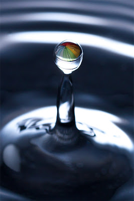
The final exercise asks us to produce a magazine cover to illustrate Rain.  Unfortunately, we have had unseasonably fair weather so I have resorted to a studio shot of a splashing rain drop.


The completed image has a reflection of a colourful umbrella to reinforce the connection to rain.  I have left plenty of room around the central part of the image to allow for the text that is necessary on a magazine cover so have thought about the practicalities of the brief as well as the shot itself.

Truth be known, I would have much preferred to have been out on a city street shooting reflected light in the glistening roadways but sometimes needs must.  Certainly setting up this shot took a lot of time and effort, but I am pleased with the finished result.


15 Oct 2011

Getting ahead of myself

Well I have completed Assignment 5 but don't feel I can send it up for assessment yet as I still have an outstanding exercise... a single photograph of Rain!  I have been waiting quite some time for a suitable day but we have had an usually dry and warm end to summer and even though we are now in autumn things are still unseasonably good.

I want to get TAoP finished so that I can move on and really need to get it done by November so if we don't have any rain in the next couple of days I will have to manufacture something.  I only have a couple of days at home between now and the end of the month as my schedule has me in Dubai for 3 days and Hong Kong/Sydney for 9 days so it is now or never.

As an aside... I re-read the Assignment 5 brief and realise that it says 6-12 pages, whilst I thought it was 6-12 images.  Luckily I have filled 6 pages with 11 images so have achieved the aim; I just feel that I could have used another couple of shots to cover more of the bat making process that I have as a subject.  Mind you, I think any editor would have trimmed my 'article' down as more than 6 pages would have been something of a rambling tome rather than a tight and interesting article.

14 Oct 2011

Shooting assignment 5

I think I have my last TAoP assignment in the bag (or on the card I should say nowadays).  The timing has been perfect as I have just finished a commercial shoot for a cricket bat maker who needed a new set of images for his latest product line and web site.  So I set up a shoot at his workshop and spent two days working through his entire list of products and then I followed the craftsmen through the making of a bat, from start to finish.  

Since assignment 5 is all about a commercial magazine shoot, rather than faking something I thought I might just a well use the images from a real job.  

 The main problem I have is the layout of the 'magazine' as I have very little in my past to fall back on and I am finding the task a difficult one.  I would love to fill each page with a full size image but that is far from realistic so I am placing several photos on each page and it is that balance that is causing me most concern.

Still, I think I am just about there and will soon be working on the new web site page to show off the finished article.  


7 Oct 2011

Exercise: Juxtaposition

This exercise only requires a single image and from the brief I have chosen to create a photograph that would be suitable for a book cover.  I have chosen 'The birdman of Alcatraz'.  In order to satisfy the brief we are asked to use symbols or juxtaposition in our choice of subject.  I hope that I have managed to achieve both requirements by using the symbols of feathers and a cage to indicate the birds, the cage also acting as a reminder that this bird keeper was incarcerated in the notorious Alcatraz prison.  The metal cup reinforces the status of the inmate and his location.  Juxtaposition also occurs in the story as well... a prisoner lets his mind run free with his birds but he keeps them caged just as he is.  


Exercise: Symbols

In hand with the previous exercise we are asked to come up with our own ideas to illustrate various concepts.

I have chosen to use a couple of photographs from my library to help me to get over my ideas.

Poverty.
 Poverty is common enough for many of us to have images of beggars in the streets so this isn't a particularly novel idea and I feel a more symbolic approach might be better.  A tight shot of a tin cup with a few coins scattered around would probably be more thought provoking. Having been to Soweto in South Africa I know how striking images of poor families in front of their shacks can be.  More novel ideas include any item that might be used in place of an expensive products... newspaper sheets on a string beside an old, grubby toilet instead of pretty pink soft tissue.
  
Growth


The idea of growth goes hand in hand with new plant life so it is obvious that new shoots might be used to illustrate such a thing.  This image adds an extra element of a man growing out of the ground.  Other ideas I had for growth included the rings around a cut stump which show the number of years the tree had been growing but that would be for a more established level of growth.  As an alternative the growth of a man from child to adult has often been used... shirtless man holds baby in his arms.  A simple version of the same idea would be a shot of the classic height chart a child has on their bedroom wall showing their progress.

Crime and Silence

The hoodie has become synonymous with crime so a hooded man keeping watch while his cohort breaks in through a gate would make most of us think of crime.  A simpler image might be the end of a crowbar amongst broken glass.  Certainly other still life shots can give similar impressions... a court summons or an intent to prosecute on a kitchen table with the opened envelope.  

Silence is easy enough to show with a simple 'finger in front of lips' image which we all recognise as a shhhhh signal.  Something less obvious might be the idea of a silent movie being filmed.  The are plenty of SILENCE signs around the world that could also be used... in a reading room, at a golf competition.  A less obvious symbol might be a hearing aid that has been left behind or is broken.    

Excess
When thinking of excess most of us will immediately think of eating or drinking to excess, hence the cream pies and tape measure still life.  Less obvious might be an excess baggage label on a suitcase.  Other images might be the result of excess... a fat belly or a drunk in the gutter.


All of these ideas are generic.  A more specific brief on how the concept would be applied would make it easier to align ideas.

6 Oct 2011

Exercise: Evidence of action

When demonstrating evidence of action in a photograph it is, by definition, a photograph taken after the event... the aftermath.  Although the exercise only asks for one photograph I have taken 3 contrasting situations mainly because I enjoyed the opportunity and didn't want to leave anything out.

My first shot is taken in the Yuan gardens just after this boy has fed the Koy carp in the lake... he gazes at the milling shoal as they look for remnants of food.

This second shot is of burning prayers left by a supplicant at a Chinese temple.

My third is a little tongue-in-cheek and is of three feet in a secluded balcony! 

Abstract ideas and concepts have to be given thought when put across by an image.  Watches are often advertised with pilots wearing them, as the technical training that a pilot receives and the demands he would put on his equipment are obviously valued by the makers of a watch and their customers.  Furniture and other objects of design are often portrayed in bright colours against a monochrome background or room so that the object leaps to our attention.  Huawey is a multinational networking and telecommunications company who recently ran an add with a pair of binoculars as the central image and a statement saying, "We see our customer's needs."  The correlation between a blossoming flower and investing in Thailand made use of the traditional orchids of the country along with the idea of blossoming investments.  Banking services often use generic but happy families to personalise something that is often considered impersonal and also to imply trust.

I have copied a couple of other examples below:

Since it is hard to portray a smell in a photograph, this room freshener product uses images from nature seen from within a room to give the impression of the fragrances you can expect.

Finally, even small companies can use imagery to get across concepts:

 
This insurance company has framed their company information within an expensive looking gilt picture frame to easily and cheaply give the impression of quality to their company.

4 Oct 2011

Exercise: A narrative picture essay

This exercise requires me to dream up an assignment which tells a story.  I am limited to between 5 and 15 photographs.

I chose a subject that is close to home as I am lucky enough to have a neighbour who is a potter.  So I followed her around whilst she made a Raku Pot.  The pages of photographs are below and are best viewed by clicking on them and looking at the full sized version.


I had several problems with this task and all have given me an insight into the way I might attempt a similar task for my final assignment.  Firstly, Shrirely works in a tiny 'potting' shed which made it very difficult to get access and light.  Secondly, I found that I had shot too many similar style shots and without enough variation I felt that my article lacked impact.  Too often I had let my shots expand to include Shirley's face instead of concentrating on the detail of what she was doing.  I was forced to do a lot of cropping which was far from perfect.  I tended to stick too much to a portrait format which lacked variety when placed together on the page.  Finally, I didn't do a particularly good job of directing Shirley so her facial expressions are rather neutral instead of engaging.

Laying out photographs in an interesting manner is tricky and apart from a few photograph albums I don't really have experience of balancing them.  I wanted to give each stage of production its own page but that meant that some photos are a little repetitive as some stages involved very similar tasks.  I also tried to put every stage in without missing anything so ended up with a lot of images some of which could probably have been edited out.

However, all in all I was fairly happy with my first attempt and the experience I have gained will help enormously later on in this section.  


14 Sept 2011

Assignment 4 - Tutor Assessment

I certainly didn't have to wait long as my tutor was delightfully prompt and emailed his comments the very next day.

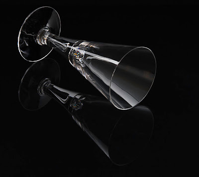
I am delighted to say that my choice of the wine glass as a subject was well received and the views that I took of it fulfilled the criteria for the assignment.  That was a big worry for me as I am never sure just how 'safe' to be when interpreting a brief.  

He thought that all the images had a high quality commercial feel to them.  This is a most interesting comment and I take it as praise since it comes from a professional photographer.  He appreciated my blog post explaining how I achieved (or should I say 'cobbled together') the setups and thought it a good idea to have tethered my camera to a laptop to better assess the success of each image. 

SHAPE 1

This was thought to be a clean shot shot just below the level of the top of the glass showing its depth and conical form.  It was thought to be slightly too perfect and the question was asked, 'was this cut in half down the centre and mirrored?' The answer was NO, just a lot of painstaking fiddling with white reflective strips to achieve the effect but my efforts were partly wasted as he would have preferred a little asymmetry instead.

SHAPE 2
 
This shot would have benefited from a slightly faster shutter speed to freeze the liquid and the background needs a little dodging attention at the top of the frame as it has lost a little light.

COLOUR 1

My tutor wasn't entirely convinced of the concept of the flying glass and thought that a night sky or cityscape might have been more fitting for a cocktail.  However, he appreciated the production of the image and how, with a glass, it is possible to apply whatever colour you want.
COLOUR 2

This was thought to be a sumptuous abstract but it was suggested that perhaps the cocktail stick and olive might have been better included in this shot to give a better idea of what it is... good point!  However, he liked the approach.
TEXTURE 1/2

These images were dealt with as one subject. He liked the fact that in the first I demonstrated that glass has pretty much no texture but in the second that there is some if you look for it.  He thought it interesting that I didn't resort to using reflections to demonstrate texture.

FORM 1/2
 
In these, my tutor praised the coloured shadow shot as it demonstrated control with a wider frame and the pool of light created another luxurious image.  Having the glass completely filled made it a more sculptural object which he appreciated.  The diffracted light in the second image was also praised and I was glad that I didn't make the mistake of desaturating it to get rid of what might have been an annoying distraction.  He also liked the wobbly reflection of the soft-box showing that the glass was not mass-produced and something of quality.
He conclusion stated that this was a really good quality assignment working with a notoriously tricky subject.  And in that one sentence all the hassle of the past week of photography felt worth it!

So chuffed but with a tight schedule I must get on with the final chapter of TAoP as time flies and I have a lot to do!


13 Sept 2011

Assignment 4 - Light

Part 4 has been a long section with some testing, difficult and time consuming exercises but it has been most enjoyable despite that.  One of the problems has been that I have been limited to doing the Assignment at home, whereas I usually get opportunities to shoot most of my work whilst I am away,  Since I get relatively little time at home, with family life also taking priority, it has been hard to find the hours. 

Despite my whining, my Light Assignment is done and can be found here.

I wait to be judged and while my tutor looks at my work I will be wondering at my choice of subject.  I might have gone out on a limb by choosing a clear wine glass.  I hope that my tutor doesn't think that this has prevented me from fulfilling the objectives of the assignment but I found it a challenge that was hard to resist.  Glass is a notoriously difficult thing to photograph so I hoped that if I could do it well I might get some small reward for making the attempt... or not!  Only time will tell.

The technical aspects were intriguing and I got a lot of help from textbooks including 'Light, Science and Magic' by Fil Hunter, Steven Biver and Paul Fuqua.  I relied on a lot of back lighting be it from a soft box, snoot or the sky, as front lighting tended to come back at the camera revealing every tiny spot of dust and finger mark.  I used black and white reflectors to move light as well as black and translucent sheets of perspex.  My soft box was most useful and I used my hi-key background as a huge soft box for some shots.

Here are a few of my setups.


The glass against a black background was fairly easy.  The light source is the lastolite hi-key background which was good as it gave a large area of light to get around the background card that I was shooting against.  I had two small white cards either side of the glass and a large white card under the camera to put stripes of reflection on the glass which helped to give depth to the shot.  I was shooting tethered to my laptop so that I could examine the images in detail straight after they were taken and move things around as required.  The computer also helped as I could display the camera's live view which made accurate focus a lot easier.


Shooting the shadow image in a pool of light was also relatively simple.  I use a snoot to provide the illumination and filled the glass with weak squash to give colour to the water I used.  The hardest part was achieving the right angle for the shot so that unwanted reflections or distractions didn't spoil the image.


The close up of the base with the logo DARTINGTON was a hand held shot using a macro lens.  I wandered around looking for a suitable background and light angle to get the word lit and give some background interest.  Holding the glass at 90deg to the sky put the light through the edge of the base and then I held the glass near a flower to give the colour.  The base acted a little like a lens and it kept the edge of the petals within the rim giving a slightly surreal effect that I liked.  The hardest bit was manhandling the camera in one hand with the glass in the other... that camera isn't light!


 Shooting against the sky needed a bit of bamboo and cotton thread.  Once the glass was suspended I added the Gin and olive and then waited for a nice bit of sky to wander past.  Of course the thread had to be removed post production but that was about all that needed doing.


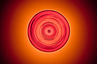
 Getting the overhead shot needed the long arm of my Uni-Loc tripod and a sheet of translucent perspex with the light below.  Once everything was in place I filled the glass and started shooting.  The uncorrected tungsten cast of the modelling lamp was just about the right shade to match the liquid.  Being a hand made glass, the imperfections showed up nicely as dark rings around the bowl.


Getting the 'splash' shot needed lots of practice at pouring water.  I set this up outside with a conventional soft box behind the glass and then threw water into it, firing the camera at an appropriate moment.  The flash duration was, of course, a lot faster than the shutter speed and being the main light source it froze the action despite having the camera at only 100th sec. As can be seen, my first efforts splashed onto the soft box so that needed cleaning and moving a bit further away!

All in all a fun time with the lens cap off and I do hope that my time and effort wasn't wasted.  I must plough on as I have the final Assignment to complete before the end of November and time waits for no man.


10 Aug 2011

The Australian Centre for Photography

Oxford Street might seem to be a strange place to find the Australian Centre for Photography but when the Oxford Street in question is in Paddington, Sydney, New South Wales, Australia, it become understandable.  The Centre is an education establishment that offers photographic courses as well as presenting exhibitions for public viewing.


There were 3 exhibitions on display when I visited and the first covered the wall of the entrance hall, '100 Portraits', a selection from the Flakphoto.com archive.  This is the first physical exhibition from Flakphoto, an online art space aimed at promoting photographers, book projects and exhibitions, developed by Andy Adams.  The collection was curated by both Andy Adams and Larissa Leclair, a photographic writer, curator and creator of Indie Photobook Library.  The aim of the exhibition is to feature 100 dynamic portraits from an exciting group of photographers in all stages of their careers and celebrate the role that a thriving online photo community plays in the discovery and dissemination of work produced by artists in the Internet Era.  The result is described as a tapestry of global exploration in portraiture and a fresh, exciting and engaging portrait of the current state of contemporary photography.  

The choice of photographs was diverse, from skinny old men sun tanning on the beach to girl and boy friends, family shots and the usual expected content of the average iPhone photo library.  Some had historic value, a photo of a photo showing a surfer with his Malibu surf board from the '50s and a group of people with white hoods like the Ku Klux Klan.  All looked rather amateurish and had no explanation as to their significance which was frustrating as pictures of Arab women wielding AK47s, a washing line strung with pencil drawings and a guy in a balaclava were shown amid family pictures... all a bit odd.  However, in the oddness was perhaps the point.  Every day pictures that have little merit, except to the people involved are the stuff of photography everywhere and just as the eye starts to become tired with them it catches a strange and inexplicable image that sparks interest.

The second exhibition I looked at was the 'Disappeared but Remained', a selection from the Korean photographers Ween-Gu Kang, Ki-Chan Kim and Gap-Chul Lee and curated by the Museum of Photography, Seoul.


 The common thread between these photographers is their attempt to demonstrate the changes that have occurred during the modernization of Korea.  Based on B&W gelatin silver prints, the work of many Korean photographs isn't seen as particularly relevant from a global point of view.  However, the medium is a good one to link the modern aspects of the images with their older archival versions.

Some of the photos were symbolic, rather than literal comparisons, the 'Solidly Built Pagoda' 1 and 2 being a pair that showed a broken picture of a traditional pagoda in the debris on the edge of a modern concrete road.  Others were images with a nostalgic point of view of old Korea before urban redevelopment, followed by their modern equivalent.  Despite the laudable objective of these images, I felt that their execution rather missed the point a bit and lacked the visual and emotional punch of other, more skilled, photographers.  Certainly, the 'exploration of evil spirits, souls and insane energy of Korean sharmanism', is a subject that must live more in the mind of the photographer than on his prints!  Overall, not a collection that either inspired or challenged me intellectually.

More to my liking was the third collection Entropy by environmental photographer, Lloyd Godman.  


Entropy is an examination of the results of a disastrous bush fire suffered by the areas of St Andrews and Kinglake in Victoria.  The images show the effects of the inferno and then the process of regeneration that the bush goes through as new life emerges from the ashes.  Godman uses several visual effects to show his images, triptychs, randomized computer projection and complex mosaics (very much my favourite).


Apart from a few large single prints, the images are shown in strips, mainly triptychs,  often looking as if they were contact prints.  The majority showed the ash covered ground and charred limbs of trees with a minority displaying the fire and the remainder demonstrating the stages of greening as new growth emerged.  Having said my favourite were the mosaics I don't think it would be hard to understand why.  Printed on glossy black the small contact print sized images were clustered in patterns with the background black aiding the construction of the mosaic.  The images were impressive on a few levels, the first being the distant impression that the pattern of images gave.  The second was the clusters of colours that each part of the cycle produced, from the swirling orange of the fire to the dull ash gray through the bright and darker greens of growth.  All beautifully coordinated to give the images a path through the mosaic.  Finally, having moved close to the pictures I could revel in the detail of the individual frames.

All in all this chance to see Godman's work in the flesh was most valuable and I came away with inspiration and ideas that, I am sure, will help my work in the future.  


This will be somewhere I will visit again on my next trip to Sydney.


18 Jul 2011

m97 Shanghai


Shanghai is a difficult city to know well.  With the obvious language barriers and differences in taste and culture I have struggled to find photography exhibitions to view.  This trip, however, I managed to locate a region of the city known as 'Creative Park M50'.  M50 refers to No 50 Moganshan Road, an area of old warehouses that have been converted into stylish galleries for art.  Even in this area there are only a few photography shows but I was lucky enough to find the m97 Gallery which specialises in contemporary photography.  Even more fortunate was a chance encounter with Steven Harris, the Director of m97, who was kind enough to give me his thoughts on the work on display. 

At the time I visited, m97 was showing a couple of solo exhibitions, one called 'Mood and Memory' by Chi Peng and another called 'Some Days' by Wang Ningde.

Chi Peng was born in 1981 and graduated from the Digital Media Department, Central Academy of Fine Arts, Beijing, China in 2005 so he is a recent addition to the world of Contemporary Photography.  Despite this he has had solo exhibitions in Berlin, Beijing and New York and participated in group exhibitions in many city including Vienna, Palm Beach, Seoul, Fukuoka Japan, Pompidou Centre France, to name just a few.


His work in this exhibition consisted of large-format panoramic photographs that represented surrealistic seascapes of his home town area.  Digital composites of images, the scenes include wide expanses of sea with large flocks of seagulls dominating the centre of the photographs.  The images invoked a dream like quality which represents Chi Peng's memories in narrative form displaying the fleeting emotions he has felt. 

I certainly liked the grandeur of the images and was impressed with the scale and imagination that it took to create such large photographs.  What I didn't like was some of the technical aspects of his work.  Objects in his photographs are often repeated, for example, the birds in the flocks are cloned many times and just changed in scale or orientation to appear different rather than being individuals.  This technique is also used in other images in a more obvious way.  His photograph called 'Children in the Rye'  and 'Catcher in the Rye' include many repeated areas, not only of the children and scarecrows but of the field of rye itself where stalks in the foreground can be seen repeated several times across the panorama. The photographer may have an emotional reason for this technique... a repeating dream thread or in the way his mind fills in the blank spaces of his memory but all I see is a laziness in his technique!

The work on display by Wang Ningde was disturbing.  I find it great when a photograph can create real emotion even when it isn't always positive.  Born in the early 70's, Wang Ningde entered the world shortly after the end of Mao's cultural revolution.  With the freedom to explore artistic expression he chose, in this work, to examine his feelings towards those repressive days.  Much of his work displays characters wearing Mao suits reflecting their thought of earlier times.  All his images have eyes shut, apparently dreaming or in despair.  The models are have ambiguous body language and are hard to interpret but all are meticulously posed by the photographer to reflect his emotional response.

 Michael Wolf's Tokyo Compression series is, in comparison to some of the work described above, a wholly understandable and admirable theme of photographs.  The theme came from a chance photograph he took of a person crushed against the steamy window of a train during the rush hour of Tokyo.  He went on to create a whole series of images in the same theme and then revisited the subject a second time.  The surrealistic look of these images are quite astounding.  Although they are of people going about their normal daily routine, the anguish and, in come cases, pain of their journey is obvious from these images.  I thought Wolf might have used models but am assured these are photographs of real travellers.  Crushed against the carriage windows they display a kaleidoscope of attitudes to their discomfort, from stoical sufferance to despair.  To achieve the surrealistic quality, Wolf has tended to focus on the wet surface of the windows with a very narrow depth of field, allowing the subject to drift into soft focus... very talented work. 


Some of the work of Robert Vanderhilst Chinese Interiors was also on display and chatting to Stephen about it I discovered that this represented many years of work throughout China documenting the interiors of rooms.  He captures a whole series of thought provoking images of people and their possessions from the lowly to the well off.  Shot with available light he manages to compose many excellent still life images as well as fascinating views of the life styles of many Chinese.  His work brought to mind the images of Russell Lee when he documented the Interior of a Black Farmer's House in 1939 and of Margaret Bourke-White who photographed a Sharecropper's Home, also during the great depresson.


3 Jul 2011

Museum of Contemporary Photography - Chicago

A few spare hours in Chicago and I discovered the Museum of Contemporary Photography (MoCP) which is part of the Columbia College.  Free to enter, this nugget of photographic interest will go into my regular list of places to visit.  Although it isn't a large exhibition space it does have enough room to display a great variety of pieces as well as conduct lectures and events. 

The show on display when I visited was entitled Public Works which wasn't something I would have necessarily earmarked to view but proved to be a fascinating series of images about construction and industry. 


The list of contributors was impressive:
Berenice Abbott,Harold Allen, Stephen Alvarez, David Avison, Tom Bamberger, Hubert Blanz, Andrew Borowiec, Frank Breuer, Mary Ellen Carroll, Alejandro Cartagena, Center for Land Use Interpretation, Chen Qiulin, Barbara Ciurej and Lindsay Lochman, Bruce Davidson, Tim Davis, Mitch Epstein, Terry Evans, Walker Evans, Robert Frank, Lee Friedlander, Ron Gordon, Eirik Johnson, Kenneth Josephson, Jay King, Viktor Kolář, Dorothea Lange, Russell Lee, Gina LeVay, O. Winston Link, Armin Linke, Vera Lutter, Danny Lyon, David Maisel, Rhondal McKinney, Tyagan Miller Richard Misrach, Carl Mydans, Martin Parr, John Pfahl, David Plowden, Merle Porter, James Rotz, Victoria Sambubaris, Daniel Shea, Toshiro Shibata, Mark Slankard, Michael A. Smith, Jamey Stillings, Stan Strembicki, Bob Thall, Sze Tsung Leong, Catherine Wagner, Andy Warhol, Jay Wolke, Thomas Weinberger, Xu Xixian and Xu Jianrong.

But as I walked around I centred on the images that impressed me rather than the photographers, particularly as I found a couple by Andy Warhol that were extremely disappointing!  Over exposed with uninspiring composition, the two small images I saw were taken early in his career with a Minox 35mm camera but their importance is due to their significance as a base for some of his later works.


A couple of John Pfahl's shots of waterfalls were included as these centred around industry associated or near waterfalls.  Looking further into his work he has a number of juxtapositions which compare the natural beauty of a flowing waterfall with the conurbations and factories that have grown up around them.  They make thought provoking as well fascinating comparisons.  One of his photographs on display was this photograph of Van Etta Falls.

Harold Allan's work caught my eye...  his simple composition of a cobbled street under Billington Railway Bridge shot in 1969, showed a perfect exposure of the gloomy arches and wet street, making a most memorable photograph.
Two photographs by Berenice Abbott an American photographer who died in 1991 were also worthy of note.  She shot the interior of an L Station on 72nd Street and managed to capture a great social scene of the twenties.  I love the atmospheric effect she obtained with the available light and the scene of commuters warming themselves by a pot bellied stove.

The exhibition also showed one of Robert Frank's works which is a 'Monument to electricity + photography'.  Frank was best knows as a film make but he returned to still photography in the 70's.  This work is a collage made of 6 3x4 prints which combine to make up a simple telegraph pole.  The pole's only significance seems to be a lost dog poster pinned to the bottom but it makes an dull and every day into something more.  My feeling is that its significance is solely due to the fame of the photographer rather than the quailty of the image.

Martin Parr had one of his 'Last Resort' works displayed.  His collection of humorous seaside photographs of the 50's are worth a look as this example shows.  The composition is great with a typical seaside view of a promenade and band stand with two kids in the foreground with buckets, spades and towels.  The completely incongruous element are the huge caterpillar treads of a digger right beside the kids who appear oblivious of its presence. 

Jamey Stillings night photograph during the construction of a bridge reveals a fantastically detailed view of the Bridge at Hoover Dam.  One of a series that he took during the time it took to build the bridge the scale and detail of the photograph, combined with the great lighting make this a stunning photograph and great series to look at.


I could have written considerably more about the many excellent photographers who contributed to this exhibition but this particular review is getting a bit long to be easily read.  Suffices to say, this was a fascinating look at a themed exhibition and perhaps more fascinating were the diversity of styles and number of well known photographers who have experimented by photographing public works!