27 Mar 2010

Exercise: Real and implied triangles

Shapes form one of the building blocks of graphic design and the simplest and most common shape is the triangle.  Any three points can create a triangle so they exist many times over in almost any view.  Triangles can be seen in many forms or they can be created by perspective, enhanced by the use of short focal length (wide angle) lenses.

This exercise asks us to produce 6 photographs to demonstrate real and implied triangles.  Firstly we are required to shoot a triangular subject and then two perspective triangles, one pointing up and one pointing down.

  
My first is a triangular subject which I found in the form of a monument to the Korean War in Washington DC.  The soldiers depicted are in an open triangular formation leading away from the viewer and although this isn't a solid triangle I felt it was more interesting than many other examples that I had to hand.  Perspective has helped to create the depth of the triangle but it is not required to create the shape itself.


My triangle pointing up is the Reflecting Pool to the Washington memorial in Washington DC.  The shape of the pool creates a perspective triangle which is nicely completed by the needle shape of the Washington memorial in the distance.


My triangle pointing down is the vaulted roof of Grand Central station in New York.  At first it was hard to work out just how to create an inverted perspective triangle since most of the time they occur looking away to the horizon or up at a building.  I just had to work out that to get the reverse I would have to be looking down a tall building or at retreating parallels that were above the horizon to get a down pointing triangle.
For the implied triangle portion of the exercise we were asked to shoot 5 or 6 objects that create a triangle shape as a still life.


My triangle with the apex at the top is made of a pile of weights that sit on an old fashioned set of scales.  The frame of the scales nicely frame the weights with their reflection in the pan coming to a convenient point.

Six screws provide the triangle apex down and I was able to reproduce the triangle twice with both the tips and bases of the screws giving rise to the shape.

The final part of the exercise was to photograph 3 people so that they formed a triangle.


These 3 guys who form part of a metal band were kind enough to pose for me and their relative heights gave rise to the triangle of faces, helped by my shooting from above their eye level.  For inspiration I thought of the work of the English photographer Mick Rock who photographed many of the most famous bands in the 70's including Pink Floyd, Ziggy Stardust and Queen whose iconic photograph for Bohemian Rhapsody used high lighting and a black background to isolate and emphasise the musicians faces.  Mick is still very active after three decades and recently photographed REM, the Foo Fighters and the Motley Crew.

Exercise: Implied lines

Implies lines are those lines that our minds put into a picture to follow a natural path or to resolve the incomplete projection of a line.  The exercise starts by asking us to look at two provided photographs and sketch in the implied lines that exist.  I have reproduced the photographs below and added the implied lines.


The left picture has three major implied lines all of which centre at the neck of the bull.  The two indicated follow the lines of the capes and the third, which is harder to illustrate is the unseen eye-line of the matador.  A less obvious line but one which adds to the flow and movement of the image is the curved red line in the sand which leads round the back of the bull fighter's feet and round to the bulls head.
 The black and white image of Corn Threshing has 3 implied eye lines which lead in a circle from the second horse to the lead horse and on to the handler who is himself carefully watching the running horses.  This circle of lines is a powerful link between the parts of the image and keeps the composition alive and full of movement.
From our own efforts we are asked to find 3 images from our stock and perform the same exercise.

This image of the Australian cricket team playing in Capetown has the fast bowler celebrating a 5 wicket haul by holding the ball aloft.  He stands ringed by his fellow players who, with one exception are concentrating on him and directing our eyes in the same manner.  The other less obvious line comes from the TV camera under the red umbrella to the left of the image which is also directed to the group.  Interesting observations come from the audience who are probably South African as, although they are sportingly applauding are looking everywhere but at the Australians.  Indeed, the little Australian wicket keeper has also found something more interesting giving the celebrations something of a staged look.


I rather like this image as the windsock, which provides a strong implied line down to the man standing by the chair, looks rather like a huge vacuum cleaner about to suck him off his feet.  The edge of the hill isn't well defined which blurs the foreground into the background and gives a strong impression of being high above the terrain.  

Here, the girl in the centre has passed a comment that has attracted glares from her fellow diners whilst she, rather smugly, sips from her wine.  The two eye lines here are strengthened by the expressions of the staring girls.

I included this fourth image out of pure interest and to illustrate some thoughts I had on the subject of implied lines.  A Chinese beggar abases himself in Shanghai and is studiously ignored by the local people around him.  I felt that this was the corollary of the direct lines that we have been looking at in previous pictures as, by gazing away and turning their backs on the beggar they are still directing our attention to him.  To see this we have to examine their body language and the way they act as a group but I feel that this is a valid effect.

The third part of this exercise required us to take further photographs which illustrate an eye line and an extension of a line or lines that point.  The next few pictures I took a couple of days ago in Washington DC.

   
Here is a cycle cop patrolling an anti terrorist barrier that helps to guard the street leading to the White House.  He has stopped to use his radio in a line of bollards that provides the implied line leading us across the picture to him.  The Do Not Enter sign helps us to understand his presence, as does the guard post.  This is a simple but effective illustration of the principle we are studying.


These photographers are taking images of the Vietnam memorial in Washington so their attention is directed towards the statue.  They have placed themselves in the eye line that the artist created when making the statues so whilst the photographers look at the soldiers, they look back.

 
Here a tourist gazes down onto the White House.  Although the face is not visible the eye line is strongly suggested and points to the building; our presence in the great USofA is emphasised by the stars and stripes on the tour bus.


I thought I would add this final image as although the lines of the great columns don't point directly at the government 'suit' who is the subject of the image, the gap between them does the job well and as such, in the same way that the beggar is being ignored in the photograph above, the line is implied.

16 Mar 2010

The Earth from the Air by Yann Arthus-Bertrand

Part of my tutor feedback mentioned the need to reference my work to existing photographers and specifically mentioned Yann Arthus-Bertrand's aerial photography as an example of work that I could have mentioned.  I should have realised the need to mention my influences as I have had some of his work on my book shelf for a few years.


Yann was born only 8 years before me in 1946 and began his career in film/photography at the age of 17 when he became a director's assistant.  After a few years he left to help run a wildlife park in the Masai Mara, Kenya and developed his passion for photography, particularly of landscapes and aerial photography from balloons.  His talent took him back to Paris where he had grown up and he became well known as a journalist, wildlife, sport and aerial photographer.  He published many books and was famous for his annual book on the French Open tennis tournament at Rolland Garros. 

In 1991 he started the world's first press agency that specialised in aerial photography.  He was sponsored by UNESCO to study the state of the world through his photography and this lead to a book called 'The Earth from Above'  which sold over 3 million copies in 24 languages.  His knowledge of the problems facing the planet have made him a committed ecologist and he has achieved wide recognition for his efforts to publicise the effects of man on the world.

The book that I have is a collection of 365 photographs, one for each day of the year, taken from the air.  It is a remarkable and fascinatingly catholic set of images that show some of the most stunning views that anyone is likely to see.  Yann has used pattens and lines in the landscape, both natural and man made to create images of great distinction.
Look HERE, HERE, HERE and HERE.

In my own way I have been able to take some aerial images but there is a great difference between the environments that we work in.  Shooting from 35,000 ft in the air, through several layers of laminated glass, plastic and metal elements that form the windows of an airliner has a challenge that Yann doesn't face.  He is able to shoot from a slow moving platform at only a few thousand feet, or lower, where atmospheric effects are negligible.  He photographs through an open door or window with nothing to blur or reflect back at him.  He is also able to direct his aircraft or helicopter to a location and repeatedly overfly it from the right angle until he has the shot that he wants.   Although some of my 320 passengers might not mind I'm afraid that the option to circle a beautiful feature isn't really an option for me!

This doesn't stop me from admiring Yann's work.  He has a fantastic eye for balancing an image and creating exciting lines and points that I am in awe of.  An example HERE of a ship carving through an ice flow is, at first glance a rule breaker (as well as an ice breaker).  The ship runs a line straight down the centre of the image but he has used the bottom third line to place it which works well.  As in many of his images he uses symmetry beautifully and the central placing lets the ship become an important part of a patten of white icebergs.  The movement of the ship gives enough dynamic feel to the shot and by using a horizontal format he emphasises the large area of ice it is sailing through.  An image of the same ice filled sea that I took falls down on many levels in comparison...
There is, of course no point of interest in the image, the ice is too far away to become anything but a random patten, the blue cast is an inevitable result of the shooting through 36,000 feet of atmosphere (what do you think makes the sky blue... it works looking down as well as up).  In addition there is a bad distortion in the bottom left part of the image from the poor optical quality of the aircraft windows.  Not all of my aerial images are so poor... this next image is a glacier flowing towards the sea in Greenland.
The lines across the ice create enough interest to form a pleasing shot despite the lack of a point of interest and I have desaturated the image to remove the blue cast.

HERE is another of Yann's beautiful shots of a black volcano in a sea of fantastic green vegetation.  The colours in this image are almost beyond belief and put my efforts below into the amateur class.
 I hope that I don't need to mention the limitations that I must overcome to get good photographs again but a quick look at the orientation and the colour stripes at the bottom of the image should give a clue!

So although I am very limited on opportunities and the environment that I shoot from I still fly with my camera beside me in case a rare chance for a good image comes along...

 The mountains of Afghanistan

Sunrise

Greenland

 Passing aircraft


 Moon rise

Reading about Yann and looking through his images has taught me to look for the same type of contrasts within the landscapes I fly over.  My aerial work has improved and I often think back to his iconic images when I am trying to compose a view through the aircraft window.  In particular, his use of lines and points is an illustration to us all on how powerful they can be.  

A lovely collection of Yann's photographs can be found HERE.

14 Mar 2010

Exercise: Curves

Curves have a feeling of movement and direction similar to diagonal lines.  The exercise requires four images that demonstrate these qualities.

1/80, f6.3, 24mm, ISO100
Covered driveway

1/500, f10.0, 82mm, ISO100
Frozen lake

1/300, f7.1, 90mm, ISO100
Fence with shadow

1/320, f8.0, 75mm, ISO100
Wind art

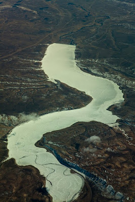
I am happier with my curve images than I was with a couple of my diagonal shots as I feel that I have got a better grip of the brief.  Certainly they all have a stronger feeling of movement and direction.  The covered driveway has a lovely pair of mirrored curves that lead away and are complemented by the concentric circles created by the paved road.  The vehicle adds to the feeling of movement and direction, albeit in a rather obvious way, nevertheless it works for me.  Below it, the Frozen lake leads right from the bottom of the shot upwards in a sensuous series of curves that takes the eye up to the less obvious river that completes the journey to the edge of the frame.  The white ice makes a great contrast between the lake and the surrounding terrain.  The iron Fence with shadow is a nice continuation of the curve to complete a half circle.  The radial lines create the sense of movement from the centre of the circle outwards.  Finally, the Wind art is a multiple exposure (albeit a digital version) which shows the potential of the moving artwork to swing in the wind.  The curved line of the building complements the curve of the artwork and the whole thing works on several levels, as a series of curves, contrasting colours and the impression of movement. 


Exercise: Diagonals

In this exercise we are asked to shoot four images that use diagonal lines strongly in the image.

 1/1000, f13.0, 105mm, ISO200
Ice cracking in Hudson Bay, Canada

 1/250, f10.0, 24mm, ISO100
Walkway in Pasadena, Calafornia

1/1600, f14.0, 105mm, ISO400
Crossing vapour trails

1/400, f9.0, 92mm, ISO100
Building front

To obtain these diagonals I have used a combination of naturally occurring diagonal lines and those created by the camera.  The particularly strong images come from those repetitive angles as in the Building front above.  Here the repetitive rhythm of the lines adds to the feeling of direction that the diagonals create.  The strong perspective created by the use of a wide angle focal length in the Walkway in Pasadena give diagonal lines that run into the distance but the angled pergola and zigzagging curb enhance the feeling of sharp and distinct lines.  To contrast the symmetry of the formal lines of building work I have included a shot of breaking ice that has natural breaks and sharp diagonals that lead across the image.  The lines of vapour trails show something that I didn't expect in that, rather than creating a feeling of movement they have a very static effect, perhaps caused by the central crossing of the lines.

7 Mar 2010

Exercise: Horizontal and Vertical lines

After points this was a delightfully simple exercise... after all, most of our creations consist of lines in one way or another.  The only trick was trying not to be too obvious or repetitive.

Horizontal lines

 
1/400, f8.0, 105mm, ISO400
Street lines for a crossing in Boston MA
 
  
1/80, f3.2, macro, ISO1250
Liquid Crystal display screen
 

 1/160, f22.0, 88mm, ISO50
Pile of plastic drink coasters with motion blur


1/320, f6.3, 105mm, ISO400
Old Glory

Vertical Lines

 
1/320, f6.3, 105mm, ISO400
Pavement decoration


1/100, f4.0, 96mm, ISO800
Escalator moving stairway


1/60, f8.0, 45mm, ISO400
Rain going down a street drain


1/80, f6.3, 32mm, ISO400
The Scientology church in Boston MA

Now it appears I can read on... 

From our text book we are asked to see which of our photographs reflects the techniques mentioned.  In the Horizontal sense Freeman suggests we could use the horizon, man-made flat surfaces, long shadows from a low sun, a row of objects, a mass of objects at a low angle.  In the Vertical sense we might use walls, posts or man made structures, tree trunks, a standing figure, a road or path, a row of objects.
From my images I can see that I have used some of the scenarios that are offered and added a few of my own although I have tended to rely on man made subjects that offer the greatest symmetry of lines.  Lines that are less formal aren't those that appealed to me and I feel that I should take them more into consideration.

Exercise: Multiple points

I have a self confessed horror of still life!  As a result this exercise has caused me no end of pain.  I have, however, done my best to produce an attractive set of points that I believe hang together as an acceptable image.

The exercise requires a series of photographs showing the stages during the construction of a still life using points.  I chose a number of wooden fruit ornaments and a bowl to place them in as my basis.  Initially I set the orientation in the vertical sense but, as you will see, changed  my mind towards the end when I realised that it wasn't working.

 
At this point I was quite pleased.  The orientation of the pears looked good and I got the apple with the hole correctly placed for the light.  I also liked the overlaps that the dark apple and the pear stalk created when they cut the circle of the plate.


By this point things are becoming confused.  The small plumb has come and gone as it was lost behind the rim of the bowl.  The position of the banana and the knife are causing me concern as I can't find a satisfactory relationship between the two.


I putting the plate and knife in a more conventional orientation has solved my balance problems and I chose to squeeze the plate to beyond the edge of the frame so that it occupied a less formal position in the shot.  The lemon has been replaced by the banana which counters the roundness of the other objects and creates a contrasting line to that created by the pair of pears.  The knife is on a third line and although I think I left it too close to the plate it looks much more natural here.  I have introduced a golden reflector to the left side of the image to lighten the shadow there and ease the rather hard lighting.

The final image.