I certainly didn't have to wait long as my tutor was delightfully prompt and emailed his comments the very next day.
I am delighted to say that my choice of the wine glass as a subject was well received and the views that I took of it fulfilled the criteria for the assignment. That was a big worry for me as I am never sure just how 'safe' to be when interpreting a brief.
He thought that all the images had a high quality commercial feel to them. This is a most interesting comment and I take it as praise since it comes from a professional photographer. He appreciated my blog post explaining how I achieved (or should I say 'cobbled together') the setups and thought it a good idea to have tethered my camera to a laptop to better assess the success of each image.
SHAPE 1
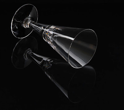
This was thought to be a clean shot shot just below the level of the top of the glass showing its depth and conical form. It was thought to be slightly too perfect and the question was asked, 'was this cut in half down the centre and mirrored?' The answer was NO, just a lot of painstaking fiddling with white reflective strips to achieve the effect but my efforts were partly wasted as he would have preferred a little asymmetry instead.
SHAPE 2
COLOUR 1
My tutor wasn't entirely convinced of the concept of the flying glass and thought that a night sky or cityscape might have been more fitting for a cocktail. However, he appreciated the production of the image and how, with a glass, it is possible to apply whatever colour you want.
COLOUR 2
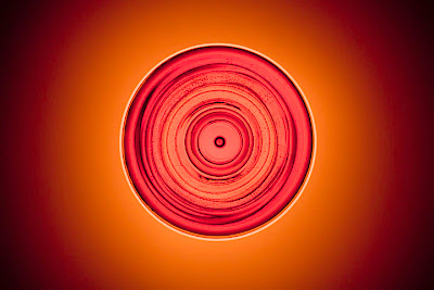
This was thought to be a sumptuous abstract but it was suggested that perhaps the cocktail stick and olive might have been better included in this shot to give a better idea of what it is... good point! However, he liked the approach.
TEXTURE 1/2
These images were dealt with as one subject. He liked the fact that in the first I demonstrated that glass has pretty much no texture but in the second that there is some if you look for it. He thought it interesting that I didn't resort to using reflections to demonstrate texture.
FORM 1/2
In these, my tutor praised the coloured shadow shot as it demonstrated control with a wider frame and the pool of light created another luxurious image. Having the glass completely filled made it a more sculptural object which he appreciated. The diffracted light in the second image was also praised and I was glad that I didn't make the mistake of desaturating it to get rid of what might have been an annoying distraction. He also liked the wobbly reflection of the soft-box showing that the glass was not mass-produced and something of quality.
He conclusion stated that this was a really good quality assignment working with a notoriously tricky subject. And in that one sentence all the hassle of the past week of photography felt worth it!
So chuffed but with a tight schedule I must get on with the final chapter of TAoP as time flies and I have a lot to do!


Good thought and explanation..keep it going..
ReplyDeleteassignment writing services