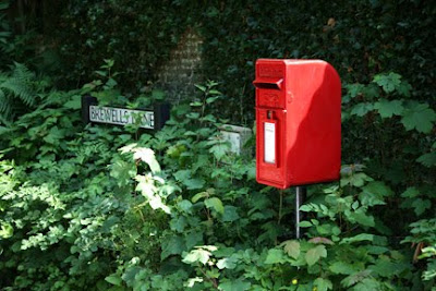
The first project is Points.
A point is one of the main building blocks in design. In order to qualify, a point must be small and have enough contrast to stand out from the rest of the frame. A point can be physical but also abstract, such as a colour, light or shadow. I have looked through some of my previous photographs and taken some out demonstrate points.
1/250, f5.6, 400mm, ISO200
The runner in this picture is obviously a point. The lines provide a geometric patten that allows his central placement to look natural and even. He is small enough in the overall shot to qualify.
Whereas the shot of the letterbox below is just too dominant to fit the definition. However, the difference between what is and what is not a point is a subjective assessment and not purely a matter of size.
1/60, f4.0, 70mm, ISO50
I have been working this morning to shoot three examples of points. The first is a spider in a frame. He sits on a bland wall and is small enough to have the right qualities. I have positioned him in a conventional position making use of the left vertical and top horizontal third lines. He looks good there as it is the normal position that you would expect to hang a frame... at eye level with more wall below than above.
1/60, f4.0, 40mm, ISO100
The second photograph is of a blue 'Historic Plaque'. This is a trifle large for a point but the viewer needs to read the text and work out what it is. It sits on a wall with symmetrical blocks of stone around and a little like the runner above, the uniform lay out of the stones allows the central placement to work.
1/200, f6.3, 82mm, ISO400
I have to be honest and say that I found it hard to find a subject that really justified placement at the edge of the frame. I took the shot below because to turn his head into a point I couldn't include any more of his body and now that I look at the result it makes a fairly comical picture! He is looking into the frame which is a good reason for having him at the bottom so it works from that point of view at least. This is certainly the weakest of the three shots.
1/320, f7.1, 105mm, ISO400
Looking through my previous images, however, I was able to easily find a shot that better demonstrates the justification for putting a point at the edge of the frame. The shot below is of a building front and the point is the old couple leaning out of their window to watch the passers by. By putting them anywhere other than the corner of the frame would have changed the layout of the shot and spoilt the geometry. It also makes them a little harder to discover and makes it more of a pleasure when the viewer finds them peaking out.
1/90, f6.7, 26mm, ISO100
I found some other good examples of points that I have placed below.
1/500, f9.5, 120mm, ISO200

1/500, f8.0, 400mm, ISO200

1/90, f6.7, 32mm, ISO200


No comments:
Post a Comment