21 Oct 2011

ASSESSMENT

I have just filled out my Assessment Application Form.  What a disappointment the on-line administration of OCA can be.  It took a long phone call to help me find the form on the web site as the links from the student handbook go nowhere and the form itself doesn't appear in the Key Resources!

Having dispatched the form I find that I can't have an assessment until March next year!  I am also a bit concerned that the only link I am asked to give is to this blog.  I have all my assignments on a separate web site and although they are linked to posts on this blog I thought there might be somewhere to put that on the form.

Should an assessor get here and still be unsure where all my assignments are, they can be found here
http://nicksoca.webs.com/photography1/artofphotography/artofphotography.htm

The links to each assignment are on the relevant tabs and to get back to the main folder click in the centre of the title The Art of Photography.

I am also required to make my tutor's feedback reports available so have downloaded them to Google Docs and link them here:


Assignment 5 - Tutor Assessment

This will probably be my LAST post for The Art of Photography as I have now completed the module and received my tutor's feedback.  

I had finished my assignment, not exactly in a rush, but without my usual lengthy pondering.  Since I had used a commercial job as the basis for my photographs I felt that I should treat the assignment in a similar way.  My customer wanted an efficient job done with a hard deadline in mind as the printer was waiting and distribution of the new season's brochures was needed promptly.  So I shot everything in two afternoons and had the pictures back to him in 48 hours.  With that in mind and considering the brief was for a magazine article I worked to a tight schedule to get the job completed with no messing about.

 This approach certainly didn't seem to affect my feedback as my tutor started by stating that he considered it a very strong assignment, very professional and would easily fit into a 'real' context.

He liked the mix of imagery mixing industrial with strong landscape work.  He liked the straightforward approach that I took, avoiding jazzy angles or anything too gimmicky.  I received praise for managing to document each stage clearly, for the layout and for the tone of the text as well.

He felt that the individual images were clear, legible and had a commercial feel to them.  He did feel, however, that because the subject was aimed at emphasising the hand-crafted and traditional approach taken by the manufacturer I might have used natural light a bit more, relying less on lighting assistance.  By using more natural light I might have generated more shadow and made the photographs more atmospheric.  In reality I only used a single reflector but the workshop was very well lit and there were few shadows to be found.  I have to say that my tutor's remarks are valid and I would have preferred the look of a single light source rather than the all round light that I achieved. I retrospect perhaps I could have generated a little more shadow by blocking light.  This is a technique I haven't practised and must give it more thought in the future.

My camera work and photoshop skills were favourably commented on but the final image of a bat floating on a background of wood detail wasn't considered as sophisticated as the rest of the spread.  It was suggested that perhaps a bat amongst wood shavings or raw timber might have looked better.  I take this point but didn't have that shot amongst my choices... in fact my only finished bat shots were product shots so I was forced to use a cut out somewhere.  We learn at every step and my learning point here was that it was the end of a long shoot and when it came to the final images my brain and trigger finger were heavily fatigued!

The final conclusion was a pleasure to read...
"Keep doing what you are doing!  Sorry I can't be more critical this time!"  

Don't worry about it Jesse, I am sure someone else will be!
16 Oct 2011

Assignment 5 - Narrative and illustration

I have now completed all the work up to and including the final assignment of TAoP and have published it at my usual web site address which is linked here:


I was lucky to be engaged by a cricket bat maker to shoot the new product lines for their latest brochure as well as providing images from the workshop to illustrate the making of a new cricket bat.  This meant I was able to mix business with pleasure and combine the aims of Assignment 5 with an actual shoot.

Exercise: Rain

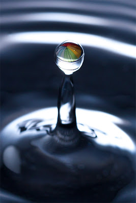
The final exercise asks us to produce a magazine cover to illustrate Rain.  Unfortunately, we have had unseasonably fair weather so I have resorted to a studio shot of a splashing rain drop.


The completed image has a reflection of a colourful umbrella to reinforce the connection to rain.  I have left plenty of room around the central part of the image to allow for the text that is necessary on a magazine cover so have thought about the practicalities of the brief as well as the shot itself.

Truth be known, I would have much preferred to have been out on a city street shooting reflected light in the glistening roadways but sometimes needs must.  Certainly setting up this shot took a lot of time and effort, but I am pleased with the finished result.


15 Oct 2011

Getting ahead of myself

Well I have completed Assignment 5 but don't feel I can send it up for assessment yet as I still have an outstanding exercise... a single photograph of Rain!  I have been waiting quite some time for a suitable day but we have had an usually dry and warm end to summer and even though we are now in autumn things are still unseasonably good.

I want to get TAoP finished so that I can move on and really need to get it done by November so if we don't have any rain in the next couple of days I will have to manufacture something.  I only have a couple of days at home between now and the end of the month as my schedule has me in Dubai for 3 days and Hong Kong/Sydney for 9 days so it is now or never.

As an aside... I re-read the Assignment 5 brief and realise that it says 6-12 pages, whilst I thought it was 6-12 images.  Luckily I have filled 6 pages with 11 images so have achieved the aim; I just feel that I could have used another couple of shots to cover more of the bat making process that I have as a subject.  Mind you, I think any editor would have trimmed my 'article' down as more than 6 pages would have been something of a rambling tome rather than a tight and interesting article.

14 Oct 2011

Shooting assignment 5

I think I have my last TAoP assignment in the bag (or on the card I should say nowadays).  The timing has been perfect as I have just finished a commercial shoot for a cricket bat maker who needed a new set of images for his latest product line and web site.  So I set up a shoot at his workshop and spent two days working through his entire list of products and then I followed the craftsmen through the making of a bat, from start to finish.  

Since assignment 5 is all about a commercial magazine shoot, rather than faking something I thought I might just a well use the images from a real job.  

 The main problem I have is the layout of the 'magazine' as I have very little in my past to fall back on and I am finding the task a difficult one.  I would love to fill each page with a full size image but that is far from realistic so I am placing several photos on each page and it is that balance that is causing me most concern.

Still, I think I am just about there and will soon be working on the new web site page to show off the finished article.  


7 Oct 2011

Exercise: Juxtaposition

This exercise only requires a single image and from the brief I have chosen to create a photograph that would be suitable for a book cover.  I have chosen 'The birdman of Alcatraz'.  In order to satisfy the brief we are asked to use symbols or juxtaposition in our choice of subject.  I hope that I have managed to achieve both requirements by using the symbols of feathers and a cage to indicate the birds, the cage also acting as a reminder that this bird keeper was incarcerated in the notorious Alcatraz prison.  The metal cup reinforces the status of the inmate and his location.  Juxtaposition also occurs in the story as well... a prisoner lets his mind run free with his birds but he keeps them caged just as he is.  


Exercise: Symbols

In hand with the previous exercise we are asked to come up with our own ideas to illustrate various concepts.

I have chosen to use a couple of photographs from my library to help me to get over my ideas.

Poverty.
 Poverty is common enough for many of us to have images of beggars in the streets so this isn't a particularly novel idea and I feel a more symbolic approach might be better.  A tight shot of a tin cup with a few coins scattered around would probably be more thought provoking. Having been to Soweto in South Africa I know how striking images of poor families in front of their shacks can be.  More novel ideas include any item that might be used in place of an expensive products... newspaper sheets on a string beside an old, grubby toilet instead of pretty pink soft tissue.
  
Growth


The idea of growth goes hand in hand with new plant life so it is obvious that new shoots might be used to illustrate such a thing.  This image adds an extra element of a man growing out of the ground.  Other ideas I had for growth included the rings around a cut stump which show the number of years the tree had been growing but that would be for a more established level of growth.  As an alternative the growth of a man from child to adult has often been used... shirtless man holds baby in his arms.  A simple version of the same idea would be a shot of the classic height chart a child has on their bedroom wall showing their progress.

Crime and Silence

The hoodie has become synonymous with crime so a hooded man keeping watch while his cohort breaks in through a gate would make most of us think of crime.  A simpler image might be the end of a crowbar amongst broken glass.  Certainly other still life shots can give similar impressions... a court summons or an intent to prosecute on a kitchen table with the opened envelope.  

Silence is easy enough to show with a simple 'finger in front of lips' image which we all recognise as a shhhhh signal.  Something less obvious might be the idea of a silent movie being filmed.  The are plenty of SILENCE signs around the world that could also be used... in a reading room, at a golf competition.  A less obvious symbol might be a hearing aid that has been left behind or is broken.    

Excess
When thinking of excess most of us will immediately think of eating or drinking to excess, hence the cream pies and tape measure still life.  Less obvious might be an excess baggage label on a suitcase.  Other images might be the result of excess... a fat belly or a drunk in the gutter.


All of these ideas are generic.  A more specific brief on how the concept would be applied would make it easier to align ideas.

6 Oct 2011

Exercise: Evidence of action

When demonstrating evidence of action in a photograph it is, by definition, a photograph taken after the event... the aftermath.  Although the exercise only asks for one photograph I have taken 3 contrasting situations mainly because I enjoyed the opportunity and didn't want to leave anything out.

My first shot is taken in the Yuan gardens just after this boy has fed the Koy carp in the lake... he gazes at the milling shoal as they look for remnants of food.

This second shot is of burning prayers left by a supplicant at a Chinese temple.

My third is a little tongue-in-cheek and is of three feet in a secluded balcony! 

Abstract ideas and concepts have to be given thought when put across by an image.  Watches are often advertised with pilots wearing them, as the technical training that a pilot receives and the demands he would put on his equipment are obviously valued by the makers of a watch and their customers.  Furniture and other objects of design are often portrayed in bright colours against a monochrome background or room so that the object leaps to our attention.  Huawey is a multinational networking and telecommunications company who recently ran an add with a pair of binoculars as the central image and a statement saying, "We see our customer's needs."  The correlation between a blossoming flower and investing in Thailand made use of the traditional orchids of the country along with the idea of blossoming investments.  Banking services often use generic but happy families to personalise something that is often considered impersonal and also to imply trust.

I have copied a couple of other examples below:

Since it is hard to portray a smell in a photograph, this room freshener product uses images from nature seen from within a room to give the impression of the fragrances you can expect.

Finally, even small companies can use imagery to get across concepts:

 
This insurance company has framed their company information within an expensive looking gilt picture frame to easily and cheaply give the impression of quality to their company.

4 Oct 2011

Exercise: A narrative picture essay

This exercise requires me to dream up an assignment which tells a story.  I am limited to between 5 and 15 photographs.

I chose a subject that is close to home as I am lucky enough to have a neighbour who is a potter.  So I followed her around whilst she made a Raku Pot.  The pages of photographs are below and are best viewed by clicking on them and looking at the full sized version.


I had several problems with this task and all have given me an insight into the way I might attempt a similar task for my final assignment.  Firstly, Shrirely works in a tiny 'potting' shed which made it very difficult to get access and light.  Secondly, I found that I had shot too many similar style shots and without enough variation I felt that my article lacked impact.  Too often I had let my shots expand to include Shirley's face instead of concentrating on the detail of what she was doing.  I was forced to do a lot of cropping which was far from perfect.  I tended to stick too much to a portrait format which lacked variety when placed together on the page.  Finally, I didn't do a particularly good job of directing Shirley so her facial expressions are rather neutral instead of engaging.

Laying out photographs in an interesting manner is tricky and apart from a few photograph albums I don't really have experience of balancing them.  I wanted to give each stage of production its own page but that meant that some photos are a little repetitive as some stages involved very similar tasks.  I also tried to put every stage in without missing anything so ended up with a lot of images some of which could probably have been edited out.

However, all in all I was fairly happy with my first attempt and the experience I have gained will help enormously later on in this section.