28 Jan 2010

Assignment 1 - My tutor's assessment.

I was really pleased that my tutor didn't keep me waiting too long as I was keen to see what he thought of my work.  My overall feeling was of relief and I don't feel that I have let myself down but this is tempered with an understanding that there is always room to improve.

The comment was made that I am fortunate; because of my job I was able to produce a variety of subjects from very different places.  The down side of this (without looking for sympathy) is that I often work jet lagged and tired with little time to achieve a result before heading home again.  In addition, the locations were not found without effort both in research, commitment and hours on trains. taxis and foot.

My blog was well received but I must make more of an effort to reference my work to other photographers, a key element of formal assessment.  This small comment opens up a Pandora's box of work as it is an area that I am sadly lacking.  I know of many iconic photographers but am not so familiar with their work that I could easily recognise their style or name them as an inspiration.  One does not get this kind of knowledge overnight and I am going to have to put in a considerable effort to raise my game here.

The photographs in my assignment were complimented and I was glad that the work that I put in was recognised.  Although my written comments on the pairs were appreciated I am going to have to be more self critical in the future. I must do that by highlighting areas of concern that I have about my work to show that I am aware of my shortcomings.  This is, of course, a double edged sword as what I might dislike may not be the same as an assessor and it always begs the question, why submit photograph that I am not completely happy with?

A few pairs received particular attention.  The MOVING squirrel photograph was well received but the STILL shot of a pair of dead badgers was not.  My attempts to produce a subdued effect through dull lighting was not considered to be effective as a richer quality to the light would have produced a better image both technically and emotionally.  The 4x4 motorcar in the shot was also thought to be too obvious and the composition would have worked better had it been left out.  In retrospect I agree with both these comments and have shots of an empty road that actually look more poignant.  The lighting, I will have to think about and although I agree that it wasn't good as it could have been I am not sure how I should have approached it.  Perhaps I should have come back at a better time of the day.

In technical areas, the blown highlights in the STRONG image of an oak tree could have been worked on to reduce their impact.  I am a relative newcomer to RAW processing and am going to have to start reading up on that to improve.

An image that received particular praise was BLACK and I was quietly chuffed to bits as I liked the shot very much myself.

Overall I am very content with the assessment but realise that this is only a first (and easy) step and there is much room for improvement.  I will work hard on my weak areas.


27 Jan 2010

Disaster

In Japan shooting part of a shrine with my wide angle lens.  Someone wants to get past so I grab my photobag and sling it on my shoulder still unzipped.  Behind me I hear a very expensive crunch which is the end of the high but perfect parabolic curve that my Canon 24-105 f4 L IS USM performed though the air before reaching the flag stones.

I feel lost without that lens as it is the mainstay of my photography and I am kind of on hold until I can get the insurance to pay up.

Sigh... 


Addendum: I have tried hard to continue my work with a wide angle, fixed 50mm and my big zoom with limited success. However, on Monday a new replacement lens arrives and I can go back to business as usual.  I had no idea how much I depended on that lens until it wasn't around to use.  

The good side is that, like the exercise in taking photos in vertical format and then trying to shoot the same subject in the horizontal format, being forced to use different lenses has made me approach subjects from a different viewpoint that I might not have otherwise used.  The downside was that trying to be subtle about shooting people in the crime ridden city of Nairobi (which we jokingly call Nairobbery) with a damn great 100-400mm telephoto clamped onto the front of my camera wasn't comfortable.  I felt like I was wearing a sandwich board which said, 'Mug Me Please!'

19 Jan 2010

Assignment 1: Contrasts (practice)


Don't get excited this isn't actually my assignment.  It is suggested that in preparation for the project we look back through our previous photographs and choose four pairs of contrasts.  This will be valuable in helping us to recognise contrasting shots for the assignment.  I have delved into one area of my photography and come up with some images that I trust will work.


HIGH/LOW


LIGHT/HEAVY


MANY/FEW


LIGHT/DARK


Having a good stock of photographs going back many years I felt that this wasn't too hard a task, although I limited myself to a small area of interest so that I could run a theme through the images to link them.  I now approach the actual assignment with trepidation as rather than being able to pick shots that have been gathered over a long time, I have to think through and then go and shoot new images.  I obviously don't want this assignment to hang around my neck for weeks but it is going to be so much harder to shoot to order!


18 Jan 2010

Exercise: Cropping

This task requires me to look back to a few old photos and re-crop them to improve their appearance and offer a fresh approach to the image.

1/125, f7.1, ISO400, 58mm

This image of an Australian aboriginal playing a didgeridoo abounds with clutter, much of it being modern day that detracts from the traditional image that I wanted to portray.  A tighter crop allows me to remove much of it and concentrate on the wizened features of the player.


 1/30, f3.5, ISO100, 33mm
Here is a shot of some grave stones in the old cemetery of Boston, MA.  Nearby is the grave of Paul Revere.  This shot of some of the broken headstones shows a rather remote image of the subject with a lot of dead leaves around and the unwanted corner of another stone in the bottom left corner.  A tighter crop allows us to centre on the rather ominous winged skull decoration and the word 'body' that jumps out of the text.  It gives the image more impact and interest.


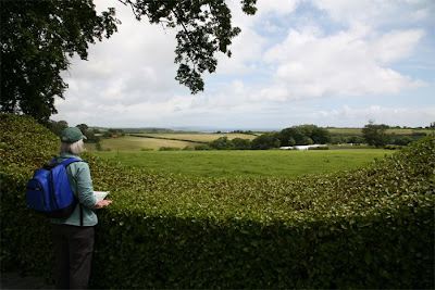
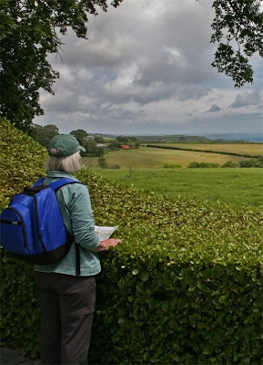
1/200, f10.0, ISO100, 24mm
This original framing concentrated on the curve of the hedge which gives a natural frame to the landscape beyond.  It doesn't really work as the view isn't that impressive, being only a few fields and trees and being a narrow strip.  By cropping tighter I have endeavoured to bring the lady into a more dominant position and increase the detail of the view so that the buildings and the horizon are more obvious.  Also the shot is more balanced as all the action was on one side and it is now more evenly distributed.


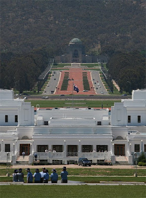
1/1000, f11.0, ISO400, 275mm
This shot of the old parliament buildings in Canberra, Australia shows three areas of interest... the line of police men in their traditional hats, the white parliament building and the avenue leading up to the war memorial.  Behind is a large hill that is almost out of the shot.  By switching to a vertical format and closing in on the guys in the foreground  the image becomes more interesting as we now see them looking down at the people on the veranda in the distance all surrounded by the magnificent view down the avenue.  It gives the shot much more interest and makes it easier to concentrate on the points of interest.


I may have fallen into a bit of a trap in this exercise as I have tended to crop in a conventional way and mainly gone from landscape to portrait to achieve the desired effect.  I think that all the crops work well but wonder if I could have been a bit more imaginative in my choice of photographs and options for changing them.  However, my first assignment is looming and I truthfully want to get past these exercises and start work on it in earnest.

17 Jan 2010

Exercise: Positioning the horizon

Experimentation on the position of the horizon is the purpose of this exercise.  Because of the foul weather I have resorted to using one of my stock photographs and altered it to move the horizon to three different positions.
Here the horizon is in a high position putting the emphasis on the foreground.  Luckily there is plenty in the foreground warrant such a position and it works quite well.  What we can see of the sky makes it look deceptively bland so at first glance it would appear have been a good decision.

 Placing the horizon in the centre is rarely a good place to put it as it divides interest between the two halves of the picture and neither receives sufficient attention.

A low horizon looks good on this photo as there is quite a dramatic sky to look at but from the shots above we know that there is also a lot of interest to be found in the foreground and in this crop it is lost. 

My preference is to the position of the original horizon, about 1/3 from the bottom which allows the striking sky to be seen in all its magnificence but also allows the city in the foreground to play a part in adding to the interest of the image.

16 Jan 2010

Exercise: Balance

This exercise involves finding half a dozen previous pictures and sketching the main areas of interest and then seeing if they balance or not.  I am a little puzzled by this concept of balance as it would seem that balance can be a good thing and unbalance can also be a good thing.  In other words does balance actually matter?  Balance comes from symmetry in composition but symmetry tends to be static and can lead to uninteresting results.


1/800, f16.0, ISO640, 50mm
This broken window with its shutter hanging off has two main elements.  The subordinate element is the hanging shutter which lies at an angle leading the eye up to the window through which can be seen leaves and sky as the house is a ruin.  The picture is fairly symmetrical in the horizontal sense but has a larger proportion of interest above the centre so would be heavier to the upper portion of the shot.


1/800, f18.0, ISO400, 17mm

  This picture is bilaterally symmetrical apart for the city sky scrapers on the left horizon.  The radiating lines of cables and path all lead towards the stone tower that dominates the image.  Apart from the city skyline the picture is balanced horizontally and weighted to the bottom vertically.


composite photograph
The arches dominate this photograph and the descending size leads the eye across the photograph to the centre arch which has the interest of the roof and clock tower.  The photo is overweighted to the left but this gives the eye a starting point to investigate down and into the photograph. 


1/50, f5.0, ISO640, 45mm
This cafe has at least 3 main elements, the fan, the coca cola sign and the window.  They have nearly equal dominance but lie mainly to the left of the centre so bias the picture in that direction.  Because the photo is taken with a slant towards the left this gives it a natural feel in that direction.


1/125, f11.0, ISO100, 19mm
This field has only one main object, the tree.  However, the fence posts spayed radially and in a line leading up to the tree form another prominent feature.  This is where balancing objects rather breaks down as a line through the picture carries a great deal of visual weight but no single position.


1/100, f7.1, ISO400, 24mm
When I drew out the weighing scales for this picture I couldn't see how it weighed up in the horizontal sense, just the vertical with the sky line weighed against the diminishing line of the vines.  Now that I look at it again I can see that the two main vines left and right are equally balancing and although they point to the left of centre their position is counterbalanced by the city on the skyline.
 
I started this exercise unsure of the relevance and I still feel that since both balanced and unbalanced photographs have their place then why are we trying to establish which is which.  But I guess that is the point.  By establishing what is the balancing or unbalancing component of a picture we are able to use that knowledge in order to ensure that we correctly apply the principle to get the desired effect.

Exercise: Vertical and horizontal frames

This exercise requires us to photograph a number of subjects in the vertical (portrait) format and then re shoot the same in the horizontal (landscape) format.  I shot the following photographs within a 5 block square in central New York.  I have grouped the images in pair so that it is easier to compare the two formats.


Burger Boy |. 1/160, f4.5. ISO400, 105mm


Burger Boy _. 1/160, f5.6, ISO400, 84mm. 

It is interesting to me that the original shot in portrait encompasses and frames the guy at the table eating his burger well but the landscape view includes the empty chair opposite him and reveals him to be eating alone.  The empty chair is important as it gives another dimension to the shot as well as balancing the image which gave too much dominance to the burger eater in the portrait format.


Window Dressing |. 1/60, f5.6, ISO400, 35mm


 Window Dressing _. 1/60, f5.0, ISO400, 47mm

In this pair the vertical format works well to create a fuller image of the window with more detail of the surrounds, particularly the reflection of the lorries on the other side of the street putting the image into context.  In the horizontal format more emphasis is put onto the mannequins, their expressions and the fact that they are looking in different directions.


Scooter |. 1/40, f4.5, ISO400, 28mm


  Scooter _. 1/30, f4.0, ISO400, 35mm

The scooter makes a good image standing outside the bar, it looks very European.  The horizontal lines of the scooter look good beside the vertical line of the bar sign, both picked out in red.  The vertical format is good for this shot.  In the landscape format I was able to bring in the big red slab of the bar door area.  This changes the photo completely giving it a divided look and putting the scooter into a subordinate position.  The emphasis of the photo is now the bar, it's interior and the scooter is giving more information rather than being the main subject.


Asleep |. 1/400, f8.0, ISO400, 105mm


Asleep _. 1/400, f11.0, ISO400, 50mm

This guy is asleep on his feet, propped up by the table.  A natural shape for the vertical format it becomes a study of him alone in the world.  By desaturating the image I can give more emphasis to the shadows which give strong lines across the image.  Monochrome also adds to the rather desperate situation of a homeless guy in a park when the temperature is below zero and a biting wind blowing.  In the horizontal format the subject becomes only one element of the image which now includes the the lines from the rail, a longer harder overhead shadow, the guy buying his coffee and the street behind.  The original sleeper is no longer alone but perhaps more isolated because he has no interest in all that is going on around him.


Grace |.  1/200, f10.0, ISO400, 24mm


 Grace _. 1/200, f7.1, ISO400, 80mm 

The Grace building is aptly named as it is a strikingly beautiful building with the flowing lines curving out towards the bast emphasised by the straight line of windows down the side.  The reflective image caused by the adjacent glass building also completes the unseen side of the sky scraper.  Any tall building suits a vertical format so it is hard to see how else this could be photographed.  For the horizontal image I chose to isolate the black and grey squares that lead into the entrance.  It is really a completely different image but has a geometric charm of its own.  I also reduced the saturation slightly so that the monochrome effect of the stone would be more obvious.


 Hot dog stall |. 1/125, f7.1, ISO400, 50mm


Hot dog stall _. 1/125, f7.1, ISO400, f35

There isn't a great deal to choose between the two formats.  The vertical allows more concentration on the guy pulling his hot dog stall and the image is nicely framed by the curved traffic light above his head.  The horizontal shows the entire stall being pulled along the street, putting it more into context but not adding a lot to the composition.


Bikini |. 1/100, f6.3, ISO400, 50mm


Bikini _. 1/100, f7.1, ISO400, 40mm

These shots of people passing a shop window showing bikini clad mannequins when the temperature is below zero have a lovely sense of the ridiculous.  I have taken the shots to B&W as it suited the monochromatic theme of the black bikini and pure white mannequins as well as enhancing the feeling of cold outside the shop front, it also removed the distraction of some red reflections on the glass.  The vertical shot works better as it limits the view to the 2 models and the lady in the fur coat and looses nothing.  Whilst the horizontal shot also works, there is a little more of the street to distract the viewer from the point of the photograph.


515 |. 1/200, f7.1, ISO400, 58mm


 515 _. 1/250, f8.0, ISO400, 65mm


The vertical format again favours the subject here as it allows the inclusion of the background building which gives the 515 number context as a street number on 7th Avenue.  The strong line of the pole carrying the traffic light also becomes an important feature leading the viewer across the image and adding to the dynamics.  The horizontal format feels like an abbreviated view of the same image with the detached elements of the sign, the light and the adjacent building.  The combination doesn't work as well as in the vertical shot.


Pizza |.  1/100, f6.3, ISO400, 50mm


Pizza _. 1/100, f6.3, ISO400, 32mm

The pizza sign holder makes an obvious subject for the portrait format and the shot puts him in the street, in context and it makes a good shot of the scene, albeit a rear view.  The horizontal view, however, allows the inclusion of another sign holder who has seen my photographic attention and is now sharing a joke with the pizza man.  This adds another element to the photograph which combined with the street sign, the yellow cab and the background firmly places the shot.  Despite the attraction of the initial vertical orientation, in this case the horizontal shot works much better.

In summary, by being forced to use only one format to shoot photographs I naturally chose subjects that had vertical extent and would suit the shape of the frame.  Of interest, when I looked at the subjects again with a horizontal format in mind I was, in some cases, able to get a better photograph by including more of the surrounding area into the image.  The main difference was that subjects which worked in isolation could be more easily photographed in the vertical format rather than those which needed visual explanation.


The Metropolitan Museum of Art - 13 Jan 2010 'Surface Tension'

 
The Metropolitan can be found in New York on 82nd and 5th on the East side of Central Park about half way up.  It is a grand and imposing building which rightly contains some of the most famous works of art in the world.  I was photographing the Frank Lloyd Wright designed Guggenheim Museum just up the road for future use in 'curves' and decided to pop in to the Met to view their photographic section on the second floor.

 
Taking  a camera bag into the museum requires a special pass and the bag must be worn on the front when inside!  The interior is as magnificent as the exterior and makes one feel quite insignificant beside such grandeur in both architecture and art.


The most disappointing aspect of the visit was, unfortunately, the photography area.  Consigned to a small area of one corridor it is very limited but does contain some gems.  I had never seen a Daguerreotype image in real life and was amazed by the magical quality that it had.  Being exposed onto silvered glass it has a reflective quality that from many angles looks like a delicately engraved glass mirror.  It isn't until it is viewed from directly ahead that the true image magically becomes clear showing an intricate B&W image in perfect detail.  I was spell bound by its beauty and now understand how the manufacture of such images became so popular in its time.  The photograph on display was by Bennet and titled Siblings.

I was also taken by Felix Teynard's salted paper exposure from a paper negative to see for myself how good such images were.  Having read about Fox Talbot's work in creating the first negative to positive photography, but never having seen one of this type I was impressed with the tones that had been available using this technique.

A name that leapt from the wall at me was of course Diane Arbus.  Her photograph titled Taxicab driver with two passengers told me all I needed to know about her skill in observing the world around her.


I left the historic section to see what was on show in the exhibit called 'Surface Tension'.  This was a special exhibition of modern photography that dealt with images that had been altered by techniques such as the addition of paint and other artistic mediums.


I felt that the more exotic works were beyond my current level so I concentrated on those images that relied more on photographic technique than artistic.

I very much liked the work of Pertti Kekarainen  whose image TILA (Passage 1) was on display.  He photographs architectural spaces and then adds optical illusions in the form of shadows and floating spots of light to complicate the act of seeing.  I found that his ability to balance his photographs and his use of proportions a perfect example of what I am learning to achieve in the framing part of this course.  He doesn't just rest with the dimensions of the spaces but of the colours as well... a very talented photographer.

Andrew Bush's piece was a collection of envelopes similar to those that can be seen using the link.  Such a simple idea but so beautifully lit I had to stand very close before I realised that they were indeed photographs and not the real thing.  Each was individually framed and a little work of art by itself but as a collection I stood and wondered what each had carried.  Messages from loved ones, telegrams bringing the despair of bad news... a clever, thought provoking collection!

Adam Fuss's photograms are well known and are a fascinating way to use such a basic photographic technique.  The image on display was made by allowing snakes to wriggle through talcum power laid on top of light sensitive paper so that the resultant exposure becomes a swirling patten of their random movement.    A huge scale for a photogram, this image was about 6ft by 5ft and an impressive piece.  I wonder, however, of the relevance of this type of work which has parallels with giving monkeys paint to play with and then describing the result as art.  The technique is clever but allowing the random movement of an unthinking beast to create the patterns does not make it art although it does make a very saleable image.


Finally I was intrigued by Miles Coolidge's photograph Accident Investigation.  Seen above it is a composite photograph of a large slab of concrete shown life size.  It is a great image in its own right having a vast size of around 30ft by 10ft and shown in brilliant detail so that every imperfection of the concrete shows up.  The fascinating side story is that this particular portion of the Santa Monica Freeway in LA was the location of an accident and the subject of an investigation.  One looks at the photo with one eye as a detective and the other as an art viewer.

So the Metropolitan provided me with a small but valuable selection of photographs to admire from some of the earliest images ever taken to some very modern and intriguing images.  Worth the visit but a shame there wasn't more that I could have seen.