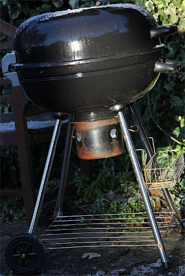
The BBQ is centre frame, shot from waist height and the photograph looks uninspiring and poorly balanced.
The second photo requires tight framing, even if that results in tilting the camera.

This shot isolates the subject from the background and makes the BBQ the one and only point of the image. The camera was turned to portrait format to suit the dimensions of the object. It isn't an attractive photograph and doesn't really merit a second glance.
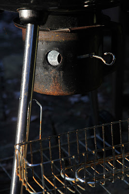
The third shot aims to be a very tightly framed shot of the object so that part of it fills the frame completely.

This shot I like. By coming around to the side of the BBQ I have been able to use the light to bring dimension to it rather than the flattening that occurred above with the direct frontal light. The image is no longer just a household object but a combination of lines, angles, textures and colours. The prominent chrome shaft demarcates the left of the frame and leads the eye up to the rusty ash box with the intriguing air hole partly open. The chrome basket makes an interesting puzzle of lines and angles in light and dark.
The final photograph is designed to put the subject into its surroundings by backing off and giving it less prominence.
Although the BBQ is still the centre of attention, lying as it does in a shaft of light, it is now off centre and balances the shot better. The light brings a shaft of colour to the image that is absent elsewhere, showing off luxuriant plant life even though snow lies on the ground. Other objects more easily take up significance, such as the snow lantern and the chair which embraces the BBQ. The weather gives the shot a forlorn look of reminding us of the past summer when we could have enjoyed eating in a warm garden that is now abandoned to the chill of winter.
The final part of this exercise is to use L frames (or the photoshop equivalent) to frame a print in various ways to see the effect. I chose the sun rise below and framed it in the ways shown.
The final part of this exercise is to use L frames (or the photoshop equivalent) to frame a print in various ways to see the effect. I chose the sun rise below and framed it in the ways shown.
I quite like this original framing and I am interested to see if any of my efforts below show any great improvement.
The first I chose was a conventional cropping that kept the original balance of the sun on the right third line and the horizon on the top third line. I was able to introduce the dark foreground line into the bottom third position and by cropping to increase the detail brought the farmhouse into more prominence to give more interest. The photo still shows the original lovely layers that give it so much depth and I feel that the loss of some of the sky and foreground didn't detract. Overall, I feel that this was at least as good as the original full size framing, if not better.
This second crop is similar to the first crop but cropped to the right, rather than the left. I first thought that this would be a weak picture but the presence of the foreground foliage to the right has a nice finishing line to the right edge of the picture which helps, since the horizon detail tends to dissapear to the right side. I like the angled line the dark foreground has but that area dominates too much of the shot so I feel my original instinct was correct and this isn't the best crop available.
This vertical crop allows the viewer to see the interest that the foreground holds. Certainly I like the hedge line and the sloping plough marks that head off down to the left but there isn't enough interest in the foreground to justify including so much of it in the shot.
Although the sky has a lovely colour banding I don't think it demands the prominence that this crop gives it. Too much of the misty middle ground that gives this photograph it's charm is lost.
This panorama is a stunning alternative to the first crop and I like it very much. It has the advantage of keeping the proportions of sky to land similar to the original photograph but excludes much of the bland parts. This allows the most interesting middle ground to gain prominence whilst being framed by the dark foreground line. Although I don't feel a panorama can work unless it is reproduced in a suitably large scale, if this were done I would be very pleased with the resulting photograph.


No comments:
Post a Comment